Tableau Formatting Series
Formatting in Tableau, in this Tutorial one, you can learn about formatting. Are you the one who is looking for the best platform which provides information about formatting in tableau? Or the one who is looking forward to taking the advanced Certification Course from India’s Leading Tableau Training Institute? Then you’ve landed on the Right Path.
The Below mentioned Tutorial will help to Understand the detailed information about formatting in tableau and How to Formatting in Tableau. So just follow all the tutorials of India’s leading Best Tableau Training institute in Bangalore and Be a Pro Tableau Developer.
Tableau allows wide array of formatting choices for customisation of the visualisations created in order to enhance the readability of the same when presented to the decision makers or the audience. Not only the content but also the containers can be customised using formatting options such as axes, workbooks, tables etc. Almost every aspect like colour, alignment, layout, font, size etc. can be customised.
Let’s explore some of the formatting techniques in Tableau. Here, we have used Sample EU Superstore data which is provided by Tableau by default.
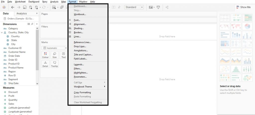
First let us begin with the Format option from menu bar in Tableau. Click on Format option from menu bar. A drop down menu would appear. This would show a few formatting options by which we would be able to customise the visualisations created. The diagram below shows the list of options under the Format menu from tool bar.
Axes Formatting
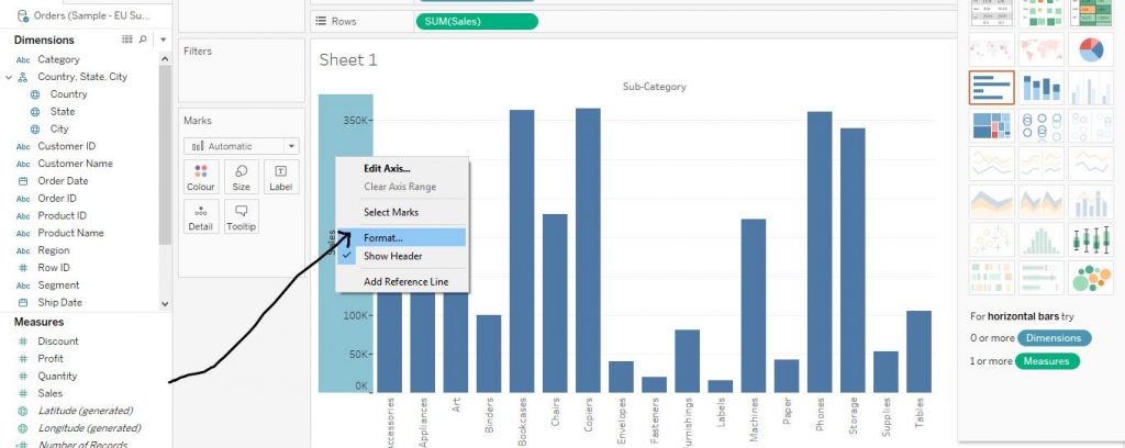
First create a bar chart by dragging Sub Category variable from Dimensions section to Columns shelf and Sales from Measures section to Rows shelf and then from Show Me section, click on Bars to create a Bar Graph. This has already been taught in detail. Please refer to the chapter on Bar Graphs for more details and customisation of the same.
Now right click on any axis and from the drop down menu, click on Format. The arrow in the diagram below explains the step.
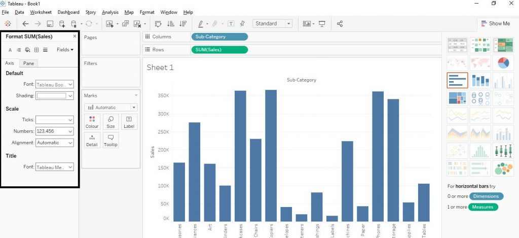
The formatting section appears to the left of the window as shown in the diagram below. From the options given, we can modify the font, shading, ticks, and alignment of the axes.
Font modifications
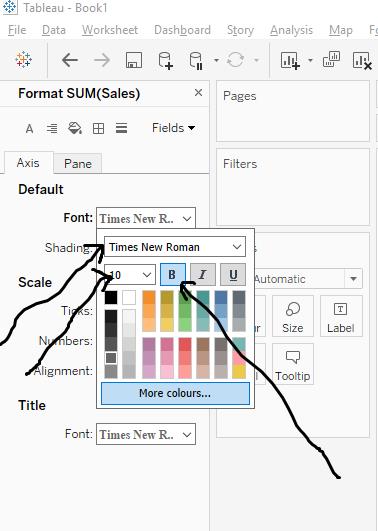
Click on Font and select any option as required. Here, we have chosen Times New Roman, 10 pt and Bold. The arrows in the diagram below demonstrate the step.
Shade and Alignments Modifications
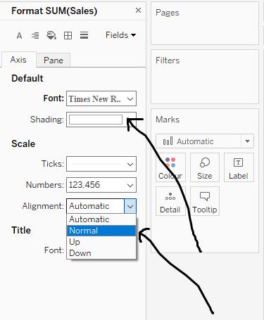
The alignment of the values in the axes as well as the shading of the colours can be modified. Click on the Shading option and choose the desired option and then move on to the Alignment option and choose the required option. The arrows in the diagram below show the step.
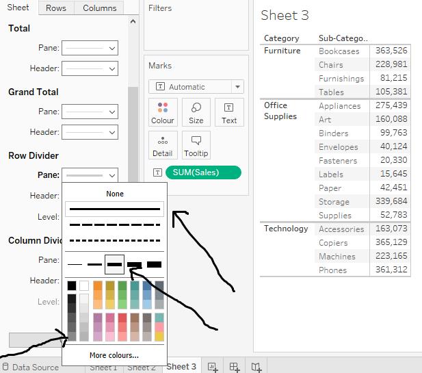
Borders Customisation
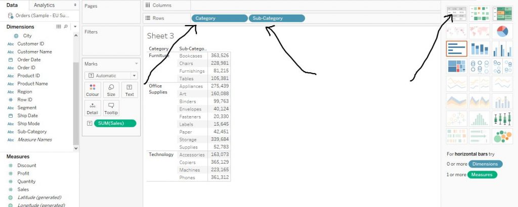
Create a Text Table for better understanding of this step. Drag Category variable from Dimensions section to Rows shelf and Sales variable from Measures section to Columns shelf. Now, from Show Me section, click on Text Tables chart option. Again, drag Sub Category variable from Dimensions section to Rows shelf. The arrows in the diagram below explain the step.Creation of Text Table Chart has already been taught. Refer to the Text Table chapter for more details.
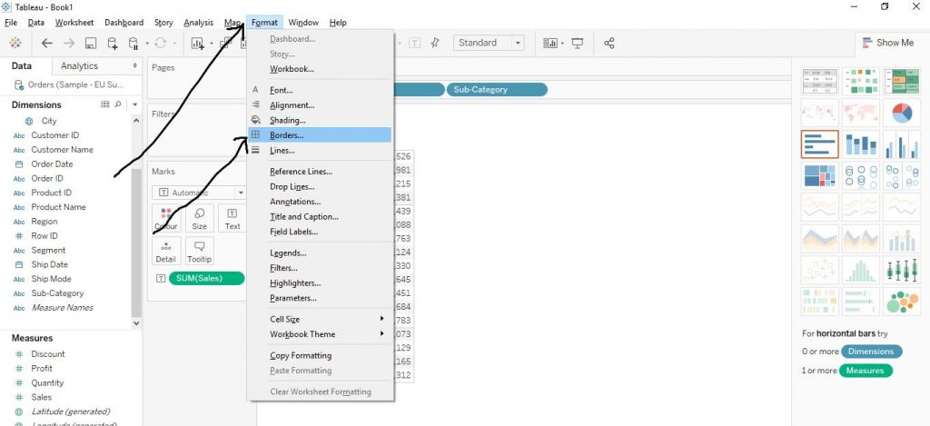
Now, from menu tab, click on Format and then click on Borders option as shown by arrows in the diagram below.
Now as per the requirement, choose suitable option like Total, Grand Total, Row Divider or Column Divider. Then choose the type of line of borders, whether dotted or straight, the width and colour of the border lines. The arrows in the diagram below help in understanding the step.