How to Build Tableau Histograms
Histogram is a graphical representation of continuous data in the form of bars with regard to underlying frequencies. It helps in determining the distribution of the data along with the skewness, kurtosis and outliers. Histograms are basically based on the area of the bars and not just the height which means that the height of the bars does not accurately represent the frequency within that very bar. The product of the height and the width of the bar, i.e., the area of the bar represents the actual frequency within that bar.
Histogram VS Bar Chart
Histogram isusually used to plot the frequencies of score occurrences in a continuous data set which has been split into classes. Whereas, Bar Charts are used for plotting of variables which are ordinal and nominal in nature.
Let’s explore Histograms in Tableau. Here we have used Sample EU Superstore datawhich provided by Tableau by default.
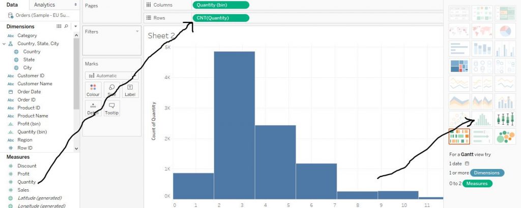
Drag a variable from Measures section (here we have chosen Quantity variable) to Rows and then click on Histogram from Show Me Section. The arrows in the figure below demonstrate the step.
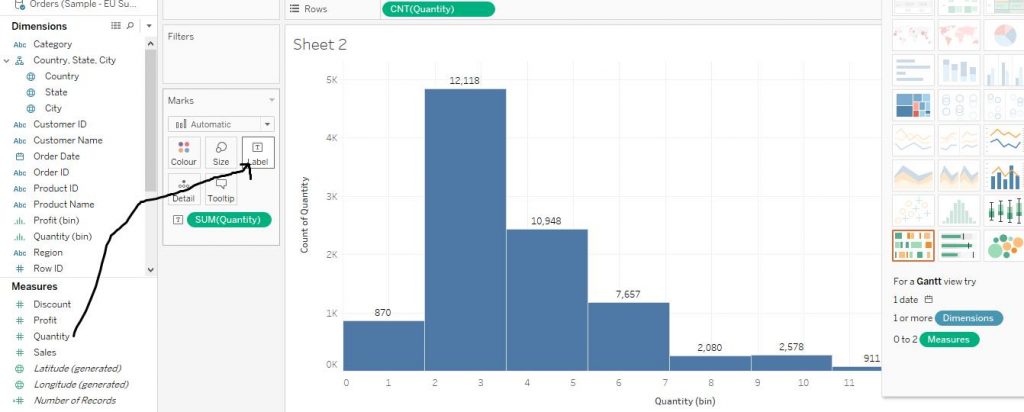
Again, in order to add labels to the chart, drag Quantity from Measures section to Label in the Marks card. The arrow in the diagram below shows the step.
Let’s learn some more customisations of histograms.
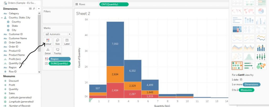
In order to make stacked Histograms, drag Region variable to Colour sectionof the Marks card. This would make the bars stacked according to the region. The diagram below demonstrates the step.
Now to let’s convert the labels on the stacked bars to percentages.In order to do the same, follow the steps.
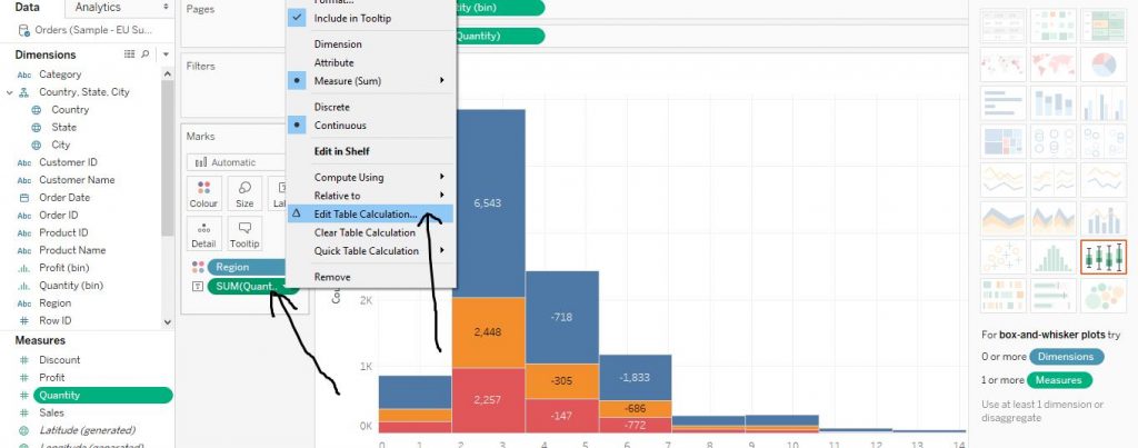
Right click on Quantity from Marks card and click on Edit Table Calculation as by the arrows in the diagram given below.
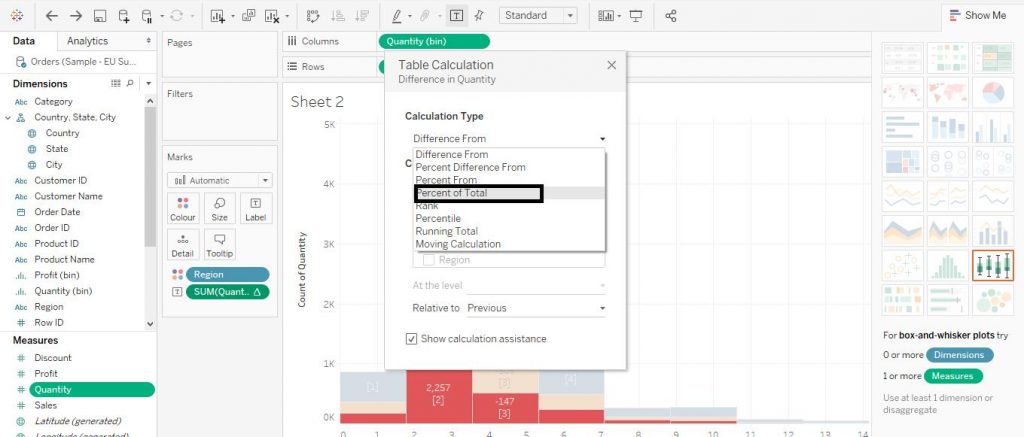
Then change the option from Difference From to Percent of Total as shown below in the diagram.
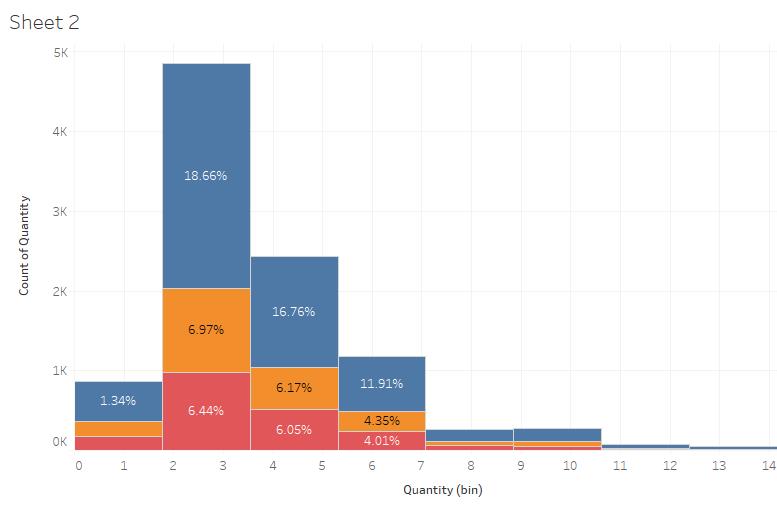
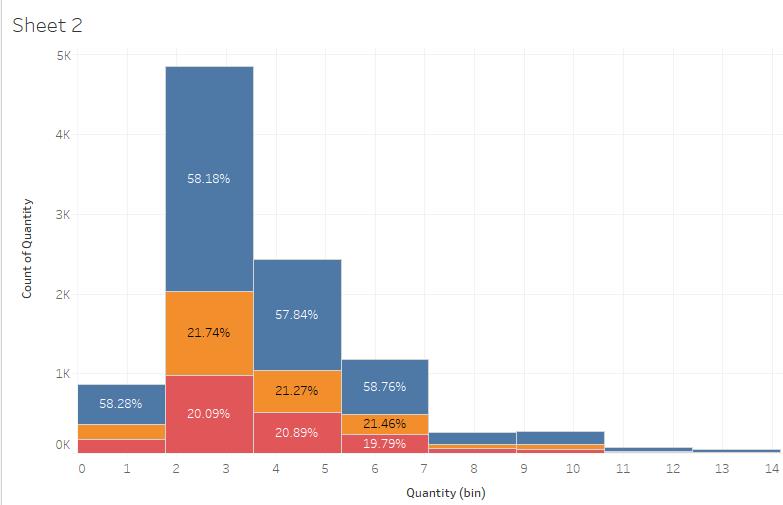
The labels would now change to percentages as shown below in the diagram.
However, notice that the percentages labelled are with regard to the individual bars but to the entire sum of quantities. This does not enhance the readability much. So in order to change the labels to percentages with regard to individual bars, follow the steps below.
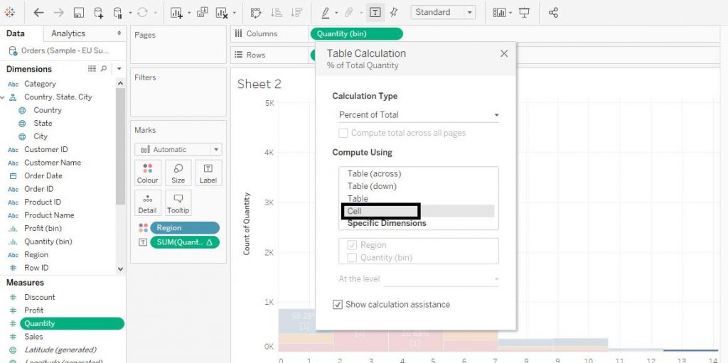
Again, right click on Quantity from Marks Card and click on Edit Table Calculation. Then from the drop down menu, click on Cell under the section of Compute Using.The diagram below demonstrates the process.
The final chart as per our requirement is shown below in the diagram.