Box and Whisker Plot
What is a Box and Whisker Plot?
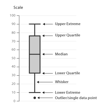
Box and Whisker Plot is also called Box Plot.It helps in displaying the data distribution by their quartiles. The lines which are extending parallelly from the boxes are called the ‘whiskers’, which help in indicating the variability outside the lower and upper quartiles. Outliers are usually plotted as individual dots which are in-line with the whiskers. Box Plots can be drawn horizontally or vertically.
Box and Whisker plots are very useful in comparing distributions between various datasets or groups. The insights which one can be drawn from Box plots are:
The key values such as: the average, median percentiles etc.
Outliers and what their values.
How tightly is the data grouped.
Skewness of data and in which direction.
Symmetry of data.
The box denotes the values between the first and third quartiles (also called interquartile range=Q3 – Q1). The whiskers denote the distances between the lowest value to the first quartile and then the fourth quartile to the highest value. Each quartile has a precise numeric value, determined from the data.
Start by finding out the median of the data and that is where the box turns from dark grey to light grey. Then, the upper and lower quartiles are found out. They are the median of the upper half of the data set and the median of the lower half of the data set. That forms the ‘box’. The maximum of the data determines the upper range whereas the minimum of the data determines the lower range. That creates the ‘whiskers’ of the plot.
Consider the numeric values given below as a data set. We would learn how to find minimum, Q1, the median, Q3, and the maximum from the following date set.
2, 3, 5, 9, 12, 15, 18, 18, 20
Minimum : 2; the lowest number
Q1 : 5; median of the lower half of data set or first quartile
Median : 12;the middle most number
Q3 : 18; median of the upper half of data set or third quartile
Maximum : 20; the highest number
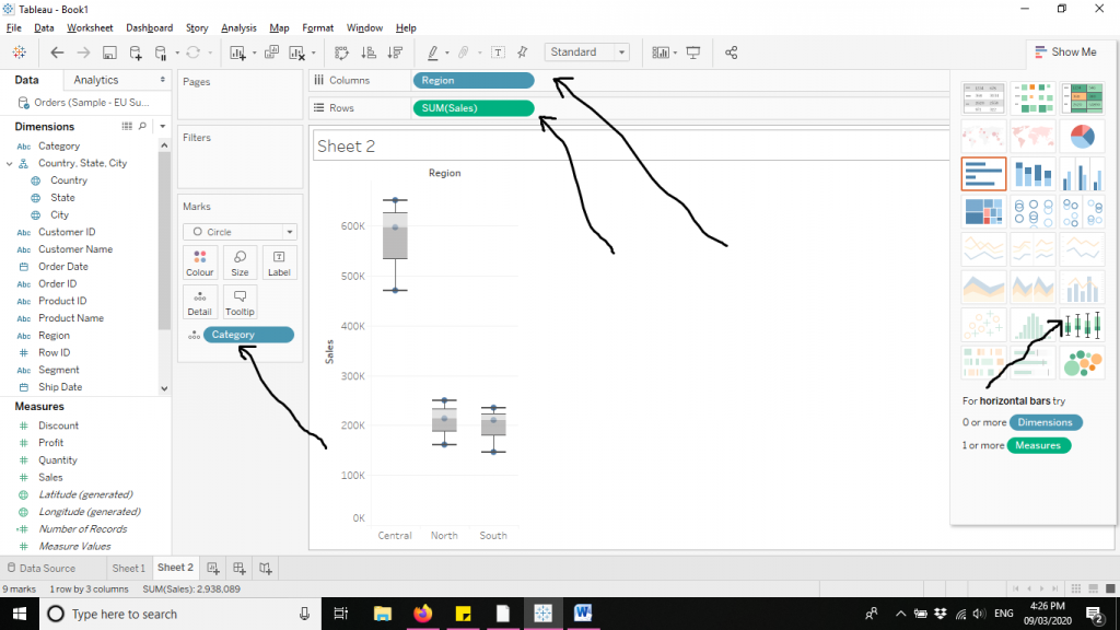
Let’s explore the Box and Whisker plots in the following steps. We have used Sample EU Superstore data which is provided by default by Tableau.
Firstly drag Sub Category and Region variables from ‘Dimensions’ to Columns. Then drag Sales from ‘Measures’ to Rows. Then click on Box and Whisker plots from ‘Show Me’ section to create the chart. The arrows in the diagram below demonstrate the same.