Tooltips in Tableau
How to Create Visual Tooltips
Get Started with Tooltips in Tableau, in this Tutorial one, you can learn how to use Tooltips in Tableau. Are you the one who is looking for the best platform which provides information about how to get Start with Tooltips in Tableau? Or the one who is looking forward to taking the advanced Certification Course from India’s Leading Tableau Training Institute? Then you’ve landed on the Right Path.
Tooltip is a GUI (Graphical User Interface) element used with a cursor or a pointer to display some information related to the part being hovered over in a small ‘hover box’.
Let’s explore the tooltips in Tableau in more detail and how to make the visualisations more informative with the use of tool tips. Here, we have used Sample EU Superstore data which is provided by Tableau by default.
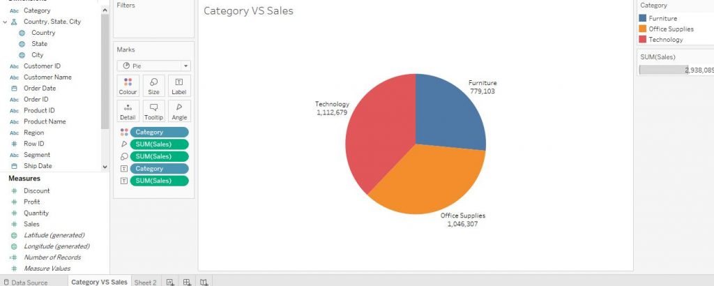
Firstly, make a pie chart by dragging Category variable from the Dimensions section to Columns shelf and then by dragging Sales variable from Measures section to Rows shelf and then by clicking on Pie Charts from Show Me section. Also add the labels. Making Pie Charts have already been taught in previous blogs, refer to the same for more details and customisations. The diagram below shows the pie chart we made.
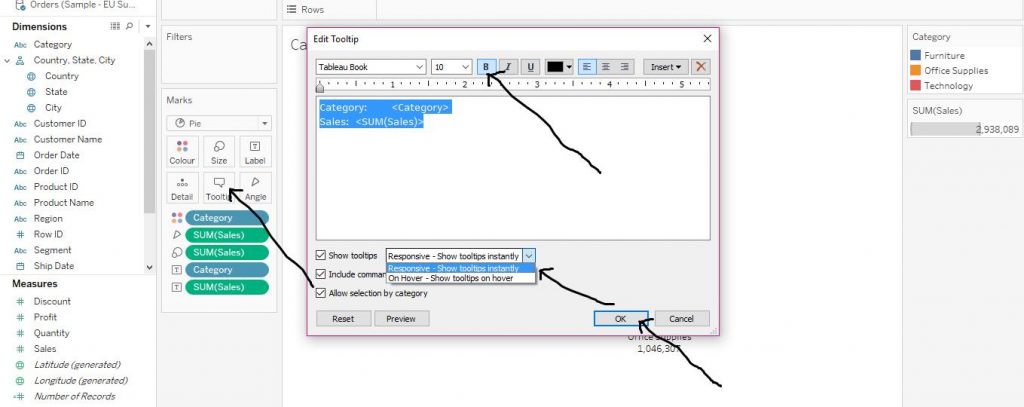
Click on Tooltip from the Marks card. Then choose the formatting options as per requirements. You can also add some more information or comment in the box, you would desire to display while hovered on the graph. Tick the Show tooltips option and click on the little arrow beside and choose Responsive – Show tooltips instantly option. Tick the below options as well. Then click on OK. The arrows in the diagram below demonstrate the step.
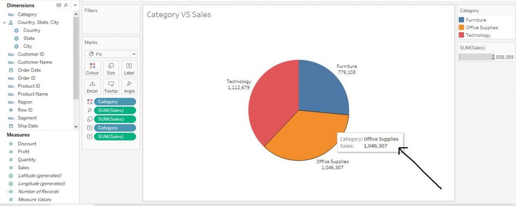
The tool tip is now shown immediately when the cursor is hovered over. The arrow in the diagram given below shows the step.
Let’s explore some customisations of tooltips.
Using other graphs as Tooltips for reference
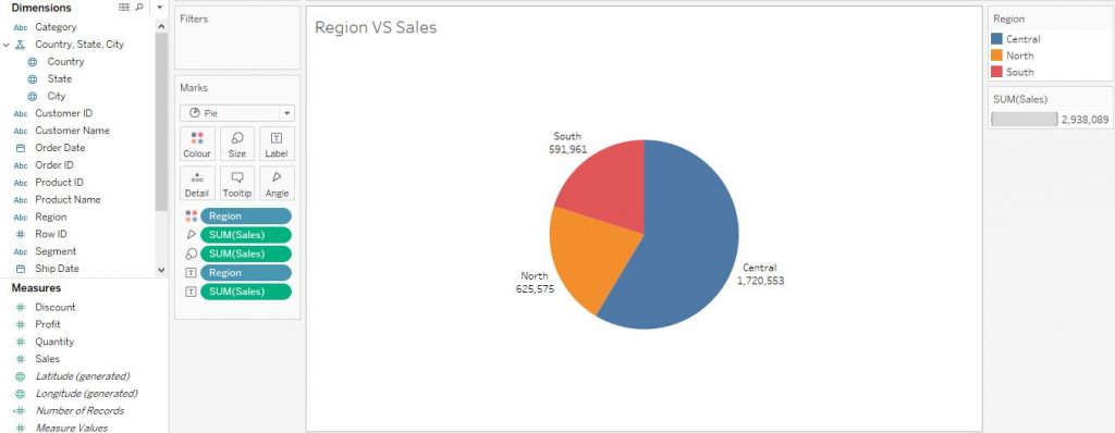
Make another pie chart of Region VS Sales in another sheet and add labels to it (follow the above steps for the same). The diagram below shows the step.
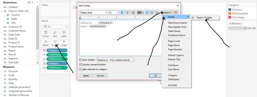
Again, return to the Category VS Sales sheet. Click on Tootltip from the Marks section. Then click on Insert. From the drop down menu, click on Sheets and then click on Region VS Sales which is basically our second sheet comprising the pie chart of Region VS Sales. The arrows in the diagram given below explain the step.
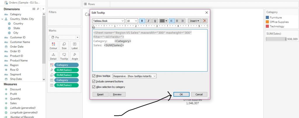
Then click on OK as shown in the arrow in the diagram below.
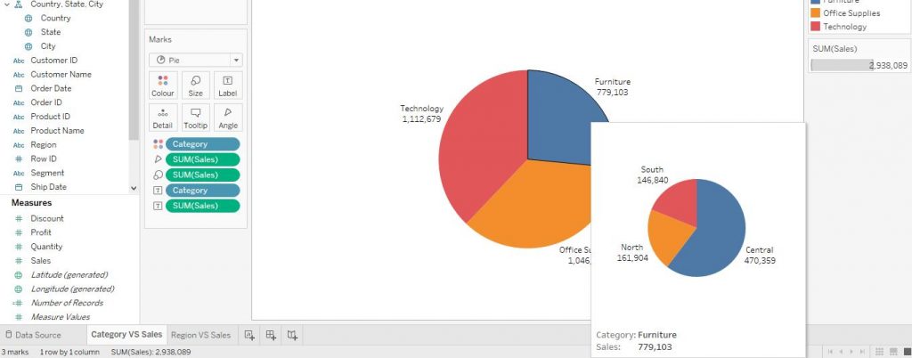
Then the tool tip shows the pie chart of Sales as per the Sub Category according to the Region when hovered over by the cursor.If you add the sales labels from the graph on the tooltip, it would be equal to the value of sales on that very segment of the pie on the current sheet.The diagram given below would help in understanding the step.
I hope you understand get started with tooltips in tableau blog. If you wish to master in Tableau, Get trained for Tableau course by Prwatech, India’s largest E-learning Platform.