#Data visualization in Python using MatPlotLib Tutorial
Data Visualization in Python using MatPlotLib tutorial, Welcome to the world of Python data visualization tutorial. Are you the one who is looking forward to knowing the introduction to data visualization with python? Or the one who is very keen to explore the Data Visualization in Python using MatPlotLib that is available? Then you’ve landed on the Right path which provides the standard information of
Python Programming language.
Data Visualization in Python using MatPlotLib is part of the Data Science with an
online python course offered by
Prwatech. Here, We will learn about the python data visualization tutorials and the use of Python as a Data Visualization tool. Also, we will learn different types of plots, figure functions, axes functions, marker codes, line styles, and many more that you will need to know when visualizing data in Python and how to use them to better understand your own data.
Do you want to know about introduction to data visualization with python, then just follow the below mentioned
Python Data visualization tutorial for Beginners from
Prwatech and take advanced
Python training like a Pro from today itself under 10+ years of hands-on experienced Professionals.
Introduction to Data Visualization in Python using MatPlotLib
1. MatPlotLib is one of the most important library, provided by
python for data visualization.
2. It supports both 2D Dimensional and 3D Dimensional graphics.
3. It makes use of NumPy for mathematical operations.
4. It facilitates an object-oriented API that helps in embedding plots in applications using
Python GUI toolkits like PyQt, WxPythonotTkinter.
5. Matplotlib requires a large set of dependencies:
6. Python (>= 2.7 or >= 3.4)
7. NumPy
8. setup tools
9. dateutil
10. pyparsing
11. libpng
12. pytz
13. FreeType
14. cycler
15. six
16. matplotlib.pyplot is a library containing the collection of command style functions that enable Matplotlib to work like MATLAB.
Types of Plots in MatPlotLib
| Function name |
Description |
| Bar |
Used to make a bar plot |
| Barh |
Used to create a Horizontal bar plot |
| Boxplot |
Used to create box and whisker plot |
| Hist |
Used to create a histogram |
| Hist2d |
Used to create a 2D histogram |
| Pie |
Used to create a Pie chart |
| Polar |
Used to create a polar plot |
| Scatter |
Used to create scatter plot of x vs y |
| Stackplot |
Used to create a stacked area plot |
| Stem |
Used to create a Stem plot |
| Step |
Used to make a Step plot |
| Quiver |
Used to plot a 2D field of arrows |
Image Functions in MatPlotLib
| Function name |
Description |
| Imread |
Used to read an image from a file into an array |
| Imsave |
Used to save an array as in image file. |
| Imshow |
Used to display an image on the axes |
Axes Function MatPlotLib
| Axes |
Add axes to a figure |
| Text |
Used to add a text to the axes |
| Title |
Used to set a title to a current axes |
| Xlable or Ylabel |
Used to set the label to x-axis or y-axis |
| X-lim or Y-lim |
Used to set a limit to x-axis or y-axis |
| Xticks or Yticks |
Used Get or set the x-limits or y-limit of the current tick locations and labels. |
Figure Functions in MatPlotLib
| Function Name |
Description |
| Figtext |
It adds text to a figure |
| Figure |
Used to create new figure |
| Show |
Used to display a figure |
| Savefig |
Used to save current figure |
| Close |
Used to close a figure |
Figure Class in MatPlotLib
The matplotlib.figure package contains the Figure class.
It is a top-level container for all kinds of plot elements.
The Figure object is instantiated by calling the function
figure() from the pyplot package.
Syntax:
g1=plt.figure()
Parameters of the figure() are as follows:
| Name |
Description |
| Figsize |
Displays width and height in inches |
| Dpi |
Dots per inches |
| Facecolor |
Figure patch face color |
| Edgecolor |
Figure patch edge color |
| Linewidth |
Edge line width |
Axes Class in MatplotLib
1. Axes object is a region of the image with the data space.
2. A particular figure may contain many Axes, but a given Axes object can only be in a single Figure.
3. The Axes contains two or three Axis objects respective to its dimensions. The Axes class and its member functions are the basic entry point to working with the Object-Oriented interface.
4. Axes object is added to the figure by calling a function add_axes().
5. It returns the axes object and adds axes at position rect [left, bottom, width, height] where all parameters are infractions of figure width and height.
6. legend(): Used to label the data with a specific name.
7. syntax: ax.legend(handles, labels, loc)
8. Where labels are a sequence of strings and handle the sequence of Line2D or Patch instances. loc can be a string or an integer denoting the legend location.
| Location String |
Location code |
| Best |
0 |
| Upper right |
1 |
| Upper left |
2 |
| Lower right |
3 |
| Lower left |
4 |
| Right |
5 |
| Center-left |
6 |
| Center-right |
7 |
| Lower center |
8 |
| Upper center |
9 |
| Center |
10 |
axes.plot():
It
plots values of an array vs another as lines or markers.
The plot() method can have an optional format string argument to specify a specific color, style, and size of line and marker.
| Character |
Color |
| ‘b’ |
Blue |
| ‘g’ |
Green |
| ‘r’ |
Red |
| ‘k’ |
Black |
| ‘c’ |
Cyan |
| ‘m’ |
Magenta |
| ‘y’ |
Yellow |
| ‘w’ |
White |
Marker codes in MatPlotLib
| Character |
Description |
| ‘.’ |
Point marker |
| ‘o’ |
Circle marker |
| ‘x’ |
x marker |
| ‘D’ |
Diameter marker |
| ‘H’ |
Hexagon marker |
| ‘s’ |
Square marker |
| ‘+’ |
Plus marker |
Line Styles in MatPlotLib
| Character |
Description |
| ‘-’ |
Solid line |
| ‘—' |
Dashed line |
| ‘-.’ |
Dash-dot line |
| ‘:’ |
Dotted line |
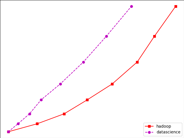
Ex) import matplotlib.pyplot as plt
y = [1, 5, 10, 17, 25,36,49, 64]
x1 = [1, 16, 30, 42,55, 68, 77,88]
x2 = [1,6,12,18,28, 40, 52, 65]
fig = plt.figure()
ax = fig.add_axes([0,0,1,1])
l1 = ax.plot(x1,y,'rs-') # solid line with yellow colour and square marker
l2 = ax.plot(x2,y,'mo--') # dash line with green colour and circle marker
ax.legend(labels = ('hadoop', 'datascience'), loc = 'lower right') # legend placed at lower right
ax.set_title("jobs as per sector")
ax.set_xlabel('medium')
ax.set_ylabel('sales')
plt.show()
Output:
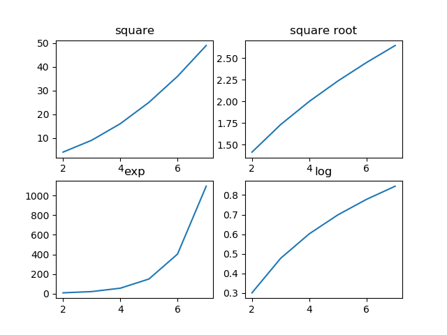
Multiplot in MatPlotLib
We can plot multiple graphs into a single canvas using multiple subplots.
Subplot() function returns axes object at a given grid position.
Syntax: plt.subplot(subplot(nrows, ncols, index)
Ex) import matplotlib.pyplot as plt
fig,a = plt.subplots(2,2)
import numpy as np
x = np.arange(2,8)
a[0][0].plot(x,x**2)
a[0][0].set_title('square')
a[0][1].plot(x,np.sqrt(x))
a[0][1].set_title('square root')
a[1][0].plot(x,np.exp(x))
a[1][0].set_title('exp')
a[1][1].plot(x,np.log10(x))
a[1][1].set_title('log')
plt.show()
OutPut:
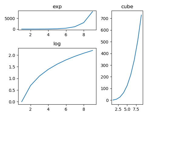
Subplot2grid() Function
It gives more flexibility in creating an axes object at a particular location of the grid.
It also allows the axes object to be spanned across multiple rows or cols.
Syntax:
Plt.subplot2grid(shape, location, rowspan, colspan)
Ex) import matplotlib.pyplot as plt
a1 = plt.subplot2grid((4,4),(0,0),colspan = 2)
a2 = plt.subplot2grid((4,4),(0,2), rowspan = 3)
a3 = plt.subplot2grid((4,4),(1,0),rowspan = 2, colspan = 2)
import matplotlib.pyplot as plt
a1 = plt.subplot2grid((4,4),(0,0),colspan = 2)
a2 = plt.subplot2grid((4,4),(0,2), rowspan = 3)
a3 = plt.subplot2grid((4,4),(1,0),rowspan = 2, colspan = 2)
import numpy as np
x = np.arange(1,10)
a2.plot(x, x**3)
a2.set_title('cube')
a1.plot(x, np.exp(x))
a1.set_title('exp')
a3.plot(x, np.log(x))
a3.set_title('log')
plt.tight_layout()
plt.show()
import numpy as np
x = np.arange(1,10)
a2.plot(x, x**3)
a2.set_title('cube')
a1.plot(x, np.exp(x))
a1.set_title('exp')
a3.plot(x, np.log(x))
a3.set_title('log')
plt.tight_layout()
plt.show()
OutPut:
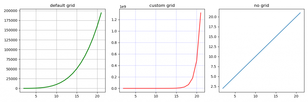
Grid()
The grid() function of the axes object sets the visibility of the grid inside a figure to on or off. You can also display major/minor (or both) ticks of the grid.
Additionally, color, line style, and linewidth properties can be set in the grid() function.
Ex) import matplotlib.pyplot as plt
import numpy as np
fig, axes = plt.subplots(1,3, figsize = (12,4))
x = np.arange(2,22)
axes[0].plot(x, x**4, 'g',lw=2)
axes[0].grid(True)
axes[0].set_title('default grid')
axes[1].plot(x, np.exp(x), 'r')
axes[1].grid(color='b', ls = '-.', lw = 0.25)
axes[1].set_title('custom grid')
axes[2].plot(x,x)
axes[2].set_title('no grid')
fig.tight_layout()
plt.show()
OutPut:
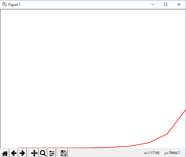
Setting Limits in MatPlotLib
This function used to set x-axis limit and y-axis limit in the graph.
Ex) import matplotlib.pyplot as plt
fig = plt.figure()
a1 = fig.add_axes([0,0,1,1])
import numpy as np
x = np.arange(1,90)
a1.plot(x, np.exp(x),'r')
a1.set_title('exp')
a1.set_ylim(0,80000)
a1.set_xlim(0,10)
plt.show()
Output:
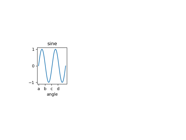
Setting Ticks and Tick Labels
This method will mark data points at the given positions with ticks.
The xticks() and yticks() functions take the list of the object as an argument.
Similarly, labels corresponding to the tick marks can be set using set_xlabels() and set_ylabels() functions respectively.
Ex)
import matplotlib.pyplot as plt
import numpy as np
import math
x = np.arange(0, math.pi*4, 0.04)
fig = plt.figure()
ax = fig.add_axes([0.2, 0.4, 0.16, 0.26]) # main axes
y = np.sin(x)
ax.plot(x, y)
ax.set_xlabel('angle')
ax.set_title('sine')
ax.set_xticks([0,3,6,9])
ax.set_xticklabels(['a','b','c','d'])
ax.set_yticks([-1,0,1])
plt.show()
Output:
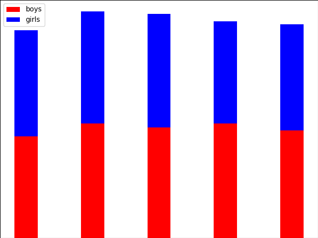
Bar Plot in MatPlotLib
Used to present the data using rectangular bars with height and width proportional to the value.
It can be plotted vertically as well as horizontally.
Syntax:
ax.bar(x, height, width, bottom, align)
The function makes a bar plot with a bound rectangle of size (x −width = 2; x + width=2; bottom; bottom + height).
Parameters of bar() functions
| Name |
Description |
| x |
the sequence of scalars represents an x coordinates of the bars. align controls if x is the bar center (default) or left edge. |
| height |
The sequence of scalars represents the height(s) of the bars. |
| width |
The width(s) of the bars default 0.8 |
| bottom |
y coordinate(s) of the bars default None. |
| align |
{‘center’, ‘edge’}, optional, default ‘center’ |
Ex)
import numpy as np
import matplotlib.pyplot as plt
N = 5
boysMeans = (120, 135, 130, 135, 127)
girlsMeans = (125, 132, 134, 120, 125)
ind = np.arange(N) # the x locations for the groups
width = 0.35
fig = plt.figure()
ax = fig.add_axes([0,0,1,1])
ax.bar(ind, boysMeans, width, color='r')
ax.bar(ind, girlsMeans, width,bottom=boysMeans, color='b')
ax.set_ylabel('Scores')
ax.set_title('Scores by group and gender')
ax.set_xticks(ind, ('G1', 'G2', 'G3', 'G4', 'G5'))
ax.set_yticks(np.arange(0, 81, 10))
ax.legend(labels=['boys', 'girls'])
plt.show()
OUTPUT:
Histogram in MatPlotLib
A histogram is an accurate representation of the distribution of a numerical data set.
It is an estimation of the probability distribution of a continuous variable.
Follow these steps to construct a histogram:
Bin the range of values.
Divide the entire range of values into a series of intervals.
Count how many values fall into each interval.
Parameters
| x |
array or a sequence of arrays |
| bin |
integer or sequence |
| range |
It specifies the lower and upper range of the bins |
| density |
If True, then the first element of the return tuple will be counts normalized to form a probability density |
Ex)
from matplotlib import pyplot as plt
import numpy as np
fig,ax = plt.subplots(1,1)
a = np.array([22,87,5,43,56,73,55,54,11,20,51,5,79,31,27])
ax.hist(a, bins = [0,25,50,75,100])
ax.set_title("histogram of result")
ax.set_xticks([0,25,50,75,100])
ax.set_xlabel('marks')
ax.set_ylabel('no. of students')
plt.show()
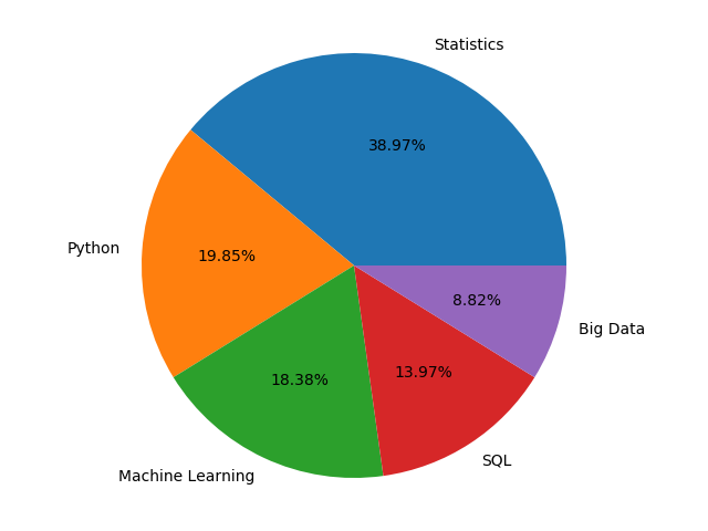
Pie Chart in MatPlotLib
A Pie Chart can only display a series of data. Pie charts display the size of items in a data series, proportional to the sum of its items.
The data points in the pie chart are displayed as a percentage of the whole pie.
Matplotlib API has a pie() function that creates a pie chart representing data in an array.
The fractional area of each item in a data set is given by x/sum(x). If the sum(x)< 1, then the values of x display the fractional area directly and the array will not be normalized. The resulting pie will have an empty wedge of size 1 - sum(x).
Parameters
| Name |
Description |
| x |
array-like |
| label |
A sequence of strings providing labels for each wedge. |
| Colors |
A sequence of matplotlib color arguments through which the pie chart will cycle. If None, then will use the colors in the currently active cycle. |
| Autopct |
string used to label the items with their numeric value.
The label will be placed inside a wedge.
The format string will be fmt%pct. |
Ex)
from matplotlib import pyplot as plt
import numpy as np
fig = plt.figure()
ax = fig.add_axes([0,0,1,1])
ax.axis('equal')
langs = ['Statistics', 'Python', 'Machine Learning', 'SQL', 'Big Data']
students = [53,27,25,19,12]
ax.pie(students, labels = langs,autopct='%1.2f%%')
plt.show()
OutPut:
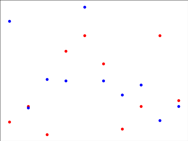
Scatter Plot in MatPlotLib
Scatter plots are used to plot data points over a horizontal and a vertical axis in an attempt to display how much one variable is affected by another.
Each row in the data table is represented by a marker the position depends on its values in the columns set on the X and Y axes.
A third variable may be set to correspond to the color or size of markers, thus adding yet another dimension to the plot.
Ex)
import matplotlib.pyplot as plt
girls_marks = [19, 30, 10, 69, 80, 60, 14, 30, 80, 34]
boys_marks = [90, 29, 49, 48, 100, 48, 38, 45, 20, 30]
grades_range = [10, 20, 30, 40, 50, 60, 70, 80, 90, 100]
fig=plt.figure()
ax=fig.add_axes([0,0,1,1])
ax.scatter(grades_range, girls_marks, color='r')
ax.scatter(grades_range, boys_marks, color='b')
ax.set_xlabel('Grades Range')
ax.set_ylabel('Grades Scored')
ax.set_title('scatter plot')
plt.show()
OutPut:
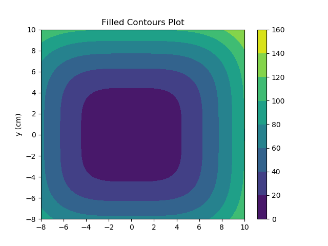
Contour Plot in MatPlotLib
Contour plots it is sometimes called as a Level Plots are a way to display a three-dimensional surface over a two-dimensional plane.
It graphs two predictor variables X, Y on the y-axis and a response variable Z as contours. These contours sometimes are called as z-slices or iso-response values.
A contour plot is appropriate when you need to see how a value Z changes as a function of two inputs X and Y, i.e. Z = f(X, Y).
A contour line or isoline of a function for two variables is a curve along which a function has a constant value.
The independent variables x and y are usually restricted to a regular grid called a mesh grid.
The numpy.meshgrid creates a rectangular grid out of an array of x values and an array of y values.
Matplotlib API also contains contour() and contourf() functions that draw contour lines and filled contours, respectively.
Both functions need 3 parameters x, y, and z.
EX)
import numpy as np
import matplotlib.pyplot as plt
xlist = np.linspace(-8.0, 10.0, 100)
ylist = np.linspace(-8.0, 10.0, 100)
X, Y = np.meshgrid(xlist, ylist)
Z = np.sqrt(X**4 + Y**4)
fig,ax=plt.subplots(1,1)
cp = ax.contourf(X, Y, Z)
fig.colorbar(cp) # Add a colorbar to a plot
ax.set_title('Filled Contours Plot')
#ax.set_xlabel('x (cm)')
ax.set_ylabel('y (cm)')
plt.show()
OutPut:
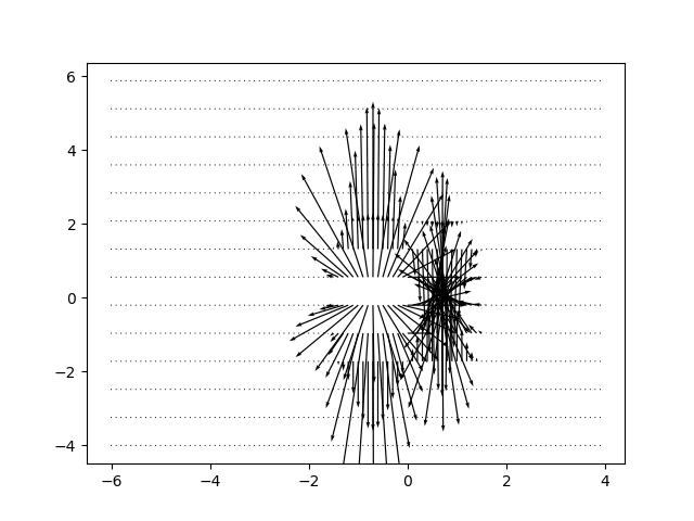
Quiver Plot in MatPlotLib
1. A quiver plot displays a velocity vector as arrows with components as (u,v) at the points (x,y).
2. quiver(x,y,u,v)
Parameters
| Name |
Description |
| x |
The x coordinates of the arrow locations |
| y |
The y coordinates of the arrow locations |
| u |
The x components of the arrow vectors |
| v |
The y components of the arrow vectors |
| c |
The arrow colors |
EX)
import matplotlib.pyplot as plt
import numpy as np
x,y = np.meshgrid(np.arange(-2, 2, .2), np.arange(-2, 2, .25))
z = x*np.exp(-x**2 - y**2)
v, u = np.gradient(z, .2, .2)
fig, ax = plt.subplots()
q = ax.quiver(x,y,u,v)
plt.show()
Output:
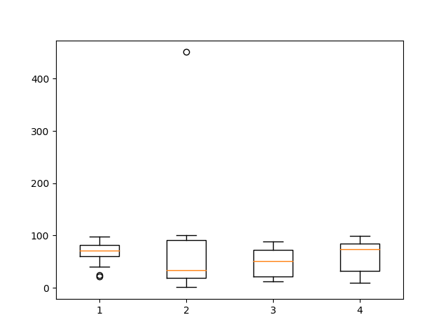
Box Plot in MatPlotLib
1. A box plot that is also called as a whisker plot displays a summary of a set of data containing the minimum, first quartile, median, third quartile, and maximum.
2. In a box plot, we plat a box from the first quartile to the third quartile.
3. A vertical line goes through the box from the median. The whiskers go from each quartile to the minimum or a maximum.
Ex)
-import matplotlib.pyplot as plt
import numpy as np
value1 = [82, 76, 24, 40, 67, 62, 71, 79, 81, 22, 98, 89, 78, 67, 72, 82, 87, 66, 56, 52]
value2 = [12, 25, 11, 35, 36, 32, 96, 95, 3, 90, 95, 32, 27, 55, 100, 12, 1, 451, 37, 21]
value3 = [23, 89, 12, 78, 72, 89, 25, 69, 68, 86, 19, 49, 15, 16, 16, 75, 65, 31, 25, 52]
value4 = [99, 33, 75, 66, 83, 61, 82, 98, 10, 87, 29, 72, 26, 23, 72, 88, 78, 99, 75, 30]
box_plot_data = [value1, value2, value3, value4]
plt.boxplot(box_plot_data)
plt.show()
OutPut:
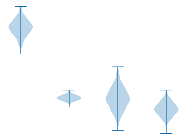
Violin Plot in MatPlotLib
1. Violin plots are just like box plots, except that they also display the probability density of data at different values.
2. These plots consist of a marker for the median of the data and a box indicating the interquartile range, similar to standard box plots.
3. Overlaid over this box plot is a kernel density estimation.
4. Like box plots, violin plots are used to display a comparison of a variable distribution or sample distribution across different categories.
5. A violin plot is actually more informative than a plain box plot.
6. In fact, while a box plot only shows summary statistics just like mean/median and interquartile ranges, whereas the violin plot shows the full distribution of the data.
EX)
import matplotlib.pyplot as plt
-import numpy as np
np.random.seed(10)
collectn_1 = np.random.normal(300, 30, 300)
collectn_2 = np.random.normal(60, 10, 300)
collectn_3 = np.random.normal(60, 40, 300)
collectn_4 = np.random.normal(20, 25, 300)
# combine these different collections into a list
data_to_plot = [collectn_1, collectn_2, collectn_3, collectn_4]
# Create a figure instance
fig = plt.figure()
# Create an axes instance
ax = fig.add_axes([0,0,1,1])
# Create the boxplot
bp = ax.violinplot(data_to_plot)
plt.show()
OutPut:
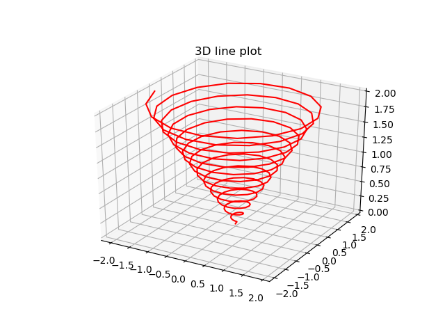
Three Dimensional Plotting in MatPlotLib
1. All though Matplotlib was initially designed with only 2D plotting into consideration, still some 3D plotting utilities were built on top of Matplotlib's 2D display in its later versions, to provide a set of tools for3D data visualization.
3. 3D plots are enabled by importing the mplot3d toolkit, included with the Matplotlib package.
Ex)
from mpl_toolkits import mplot3d
numpy as np
matplotlib.pyplot as plt
fig = plt.figure()
ax = plt.axes(projection='3d')
z = np.linspace(0, 2, 200)
x = z * np.sin(40 * z)
y = z * np.cos(40 * z)
ax.plot3D(x, y, z, 'red')
ax.set_title('3D line plot')
plt.show()
OutPut:
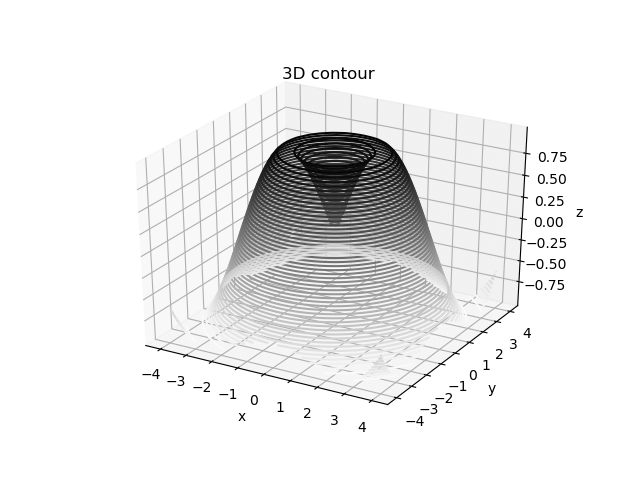
3D Contour Plot
1. The ax.contour3D() function generates 3D contour plot.
2. It needs all the input data to be in the form of two-dimensional regular grids, with the Z-data evaluated at each point.
3. Here, we will display a 3D contour diagram of a 3D sinusoidal function.
EX)
from mpl_toolkits import mplot3d
numpy as np
matplotlib.pyplot as plt
def f(x, y):
return np.sin(np.sqrt(x ** 2 + y ** 2))
x = np.linspace(-4, 4, 40)
y = np.linspace(-4, 4, 40)
X, Y = np.meshgrid(x, y)
Z = f(X, Y)
fig = plt.figure()
ax = plt.axes(projection='3d')
ax.contour3D(X, Y, Z, 50, cmap='binary')
ax.set_xlabel('x')
ax.set_ylabel('y')
ax.set_zlabel('z')
ax.set_title('3D contour')
OutPut:
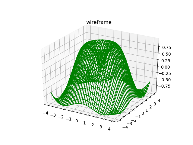
3D Wireframe plot
1. Wireframe plot takes a grid of elements and place it over the specified three-dimensional surface, and can make the resulting 3D forms quite easy to visualize.
2. The plot_wireframe() function is used for this purpose
Ex)
from mpl_toolkits import mplot3d
numpy as np
matplotlib.pyplot as plt
def f(x, y):
return np.sin(np.sqrt(x ** 2 + y ** 2))
x = np.linspace(-4, 4, 40)
y = np.linspace(-4, 4, 40)
X, Y = np.meshgrid(x, y)
Z = f(X, Y)
fig = plt.figure()
ax = plt.axes(projection='3d')
ax.plot_wireframe(X, Y, Z, color='green')
ax.set_title('wireframe')
plt.show()
plt.show()
OutPut:
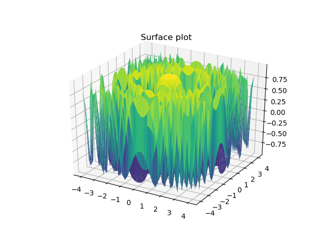
3D Surface plot in MatPlotLib
1. Surface plot displays a functional relationship between a designated dependent variable (Y), and two independent variables (X and Z).
2. The plot is a companion plot to the contour plot.
3. A surface plot is just like a wireframe plot, but each face of the wireframe is a filled polygon.
The plot_surface() function x,y and z as arguments.
Ex)
from mpl_toolkits import mplot3d
numpy as np
matplotlib.pyplot as plt
x = np.outer(np.linspace(-4, 4, 40), np.ones(40))
y = x.copy().T # transpose
z = np.cos(x ** 2 + y ** 2)
fig = plt.figure()
ax = plt.axes(projection='3d')
ax.plot_surface(x, y, z,cmap='viridis', edgecolor='none')
ax.set_title('Surface plot')
plt.show()
Output:
We hope you understand sets in Data visualization in Python using MatPlotLib Tutorial and types of plots in MatPlotLib concepts. Get success in your career as a
Python developer by being a part of the
Prwatech, India's leading
Python training institute in Bangalore.