Seaborn Library for Data Visualization in Python
Seaborn Library for Data Visualization in Python, welcome to the world of Python data visualization using seaborn. Are you the one who is looking forward to knowing the Seaborn Library for Data Visualization in Python? Or the one who is very keen to explore the Seaborn Library for Data Visualization in Python with examples that are available? Then you’ve landed on the Right path which provides the standard information of
Python Programming language.
Seaborn library is a data visualization library based on matplotlib in Python. It provides a high-level interface for drawing attractive and informative statistical graphics.Do you want to know about data visualization in python using seaborn, then just follow the below mentioned Python Data Visualisation using Seaborn tutorial for Beginners from
Prwatech and take advanced
Python training like a Pro from today itself under 10+ years of hands-on experienced Professionals.
Python Data Visualisation using Seaborn
1. In the world of Analytics, the best way to get insight details is by visualizing the dataset.
2. Datasets can be visualized by displaying it as plots that are easy to understand and explore. Such data helps in drawing the attention of key elements.
3. In order to analyze a set of data using Python, we use Matplotlib, a widely implemented 2D plotting library.
4. Similarly, Seaborn is a visualization library in Python.
5. It is built on top of Matplotlib.
Difference between Matplotlib and Seaborn
Seaborn helps resolve the two major problems faced by Matplotlib; the problems are
1. Default Matplotlib parameters
2. Working with data frames
3. As Seaborn compliments and extends Matplotlib, the learning curve is quite gradual. If you know Matplotlib, you are already halfway through Seaborn.
Important Features of Seaborn
Seaborn is built over Python’s core visualization library Matplotlib. It is used to serve as a compliment and not a replacement. Although, Seaborn comes with some very important features.
Let us see a few of them here. The features helps in
1. It is a built-in theme for styling matplotlib graphics
2. Visualizing univariate and bivariate data
3. Fitting in and visualizing linear regression models
4. Plotting statistical time-series data
5. Seaborn works better with NumPy and Pandas data structures
6. In most cases, you will still use Matplotlib for simple plotting. The knowledge of Matplotlib is recommended to use Seaborn’s default plots.
7. Installing Seaborn and getting started
8. Using Pip Installer
Installation of Seaborn
To install the latest release of Seaborn, you can use pip:
Syntax) pip install seaborn
For Windows, Linux & Mac using Anaconda
Dependencies
1.Python 2.7 or 3.4+
2. numpy
3. scipy
4. pandas
5. matplotlib
Importing Libraries
1. import pandas as pd
2. from matplotlib import pyplot as plt
3. import seaborn as sb
Importing Datasets
1. Seaborn comes with a few important datasets in its library.
2. When Seaborn is installed, datasets download automatically.
3. Loading DataSet:
4. load_dataset()
Importing Data as Pandas DataFrame
1. import seaborn as sb
2. df = sb.load_dataset('tickets')
3. print df.head()
Seaborn - Figure Aesthetic
1. Aesthetics is a set of principles concerned with nature and appreciation of beauty, especially in art. Visualization is an art of representing data in an effective and easiest possible way.
2. Seaborn comes with customized themes and a high-level interface to customize and control the look of Matplotlib graphs.
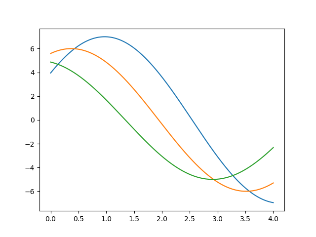
import numpy as np
from matplotlib import pyplot as plt
def sinplot(flip = 1):
x = np.linspace(0, 4, 400)
for i in range(1, 4):
plt.plot(x, np.sin(x + i * .6) * (8 - i) * flip)
sinplot()
plt.show()
Output()
Using set() functions
import numpy as np
from matplotlib import pyplot as plt
def sinplot(flip = 1):
x = np.linspace(0, 4, 400)
for i in range(1, 4):
plt.plot(x, np.sin(x + i * .6) * (8 - i) * flip)
import seaborn as sb
sb.set()
sinplot()
plt.show()
Output:
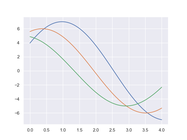 The above two figures show the difference in default Matplotlib and Seaborn plots. The representation of the dataset is the same, but the representation style differs in both.
Basically, Seaborn splits the Matplotlib parameters into two groups−
1. Plot styles
2. Plot scale
The above two figures show the difference in default Matplotlib and Seaborn plots. The representation of the dataset is the same, but the representation style differs in both.
Basically, Seaborn splits the Matplotlib parameters into two groups−
1. Plot styles
2. Plot scale
Seaborn Figure Styles
1. The interface to manipulate the styles is set_style().
2. Using this function you can set the theme of the plot.
3. As per the latest updated version, below are five themes available.
Darkgrid
Whitegrid
Dark
White
Ticks
Using Darkgrip
import numpy as np
from matplotlib import pyplot as plt
def sinplot(flip=1):
x = np.linspace(0, 4, 400)
for i in range(1, 4):
plt.plot(x, np.sin(x + i * .6) * (8 - i) * flip)
import seaborn as sb
sb.set_style("darkgrid")
sinplot()
plt.show()
Overriding the Elements
1. If you need to customize the Seaborn styles, you can pass a dictionary of parameters to set_style() function.
2. Parameters available are viewed using axes_style() function
Scaling Plot Elements
We also have control of plot elements and can control the scale of the plot using set_context() function.
We have four preset templates for contexts, based on relative size, the contexts are named as follows
1. Paper
2. Notebook
3. Talk
4. Poster
By default, context is set to notebook; and was used in the plots above.
Seaborn - Color Palette
1. Color plays an indeed important role than any other aspect when it comes to visualizations.
2. When used effectively, color can add more value to a plot.
3. A palette is a flat surface on which a painter arranges and mixes paints together.
Building Color Palette:
1. Seaborn has a function called color_palette(), which is used to give colors to plots and adding more aesthetic value to it.
2. Syntax) seaborn.color_palette(palette = None, n_colors = None, desat = No
Parameter
| Name |
Description |
| n_colors |
A number of colors in the palette.
If None, then the default depends on how the palette is specified.
By default, the value of n_colors in 6 colors. |
| desat |
Proportion to desaturate each color. |
Return
Return refers to the list of RGB tuples. Following are the readily available Seaborn palettes:
1. Deep
2.Muted
3. Bright
4. Pastel
5. Dark
6. Colorblind
It is difficult to decide which palette should be used for a given data set without actually knowing the characteristics of data. Being aware of it, we will classify the different ways of using color_palette() types:
1. qualitative
2. sequential
3. diverging
We have a function seaborn.palplot() which deals with color palettes.
It plots the color palette as a horizontal array.
Qualitative or categorical palettes are best suitable to plot the categorical data.
from matplotlib import pyplot as plt
import seaborn as sb
current_palette = sb.color_palette()
sb.palplot(current_palette)
plt.show()

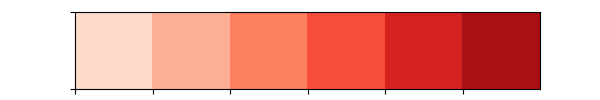
Sequential Color Palettes
The sequential plot is suitable to express the distribution of data ranging from relatively lower values to higher values within a range.
Appending an additional character ‘s’ to the color passed to the color parameter will plot the Sequential plot.
from matplotlib import pyplot as plt
import seaborn as sb
current_palette = sb.color_palette()
sb.palplot(sb.color_palette("Reds"))
plt.show()
Output()
Diverging Color Palette
1. Diverging palettes uses two different colors.
2. Each color represents variation in value ranging from common points in either direction.
3. Assume plotting data ranging from -2 to 2. The values from -2 to 0 will take one color and 0 to +1 will take another color.
4. By default, the values are centered from 0. You can control it with parameter center by passing a value.
from matplotlib import pyplot as plt
import seaborn as sb
current_palette = sb.color_palette()
sb.palplot(sb.color_palette("BrBG", 9))
plt.show()

Setting the Default Color Palette
1. The functions color_palette() have a companion called set_palette().
2. The relationship between them is similar to pairs covered in the aesthetics chapter.
3. The arguments are same for both set_palette() and color_palette(), but the default Matplotlib parameters changed so that the palette is used for all plots.
import numpy as np
from matplotlib import pyplot as plt
def sinplot(flip = 1):
x = np.linspace(0, 4, 400)
for i in range(1, 4):
plt.plot(x, np.sin(x + i * .6) * (8 - i) * flip)
import seaborn as sb
sb.set_style("white")
sb.set_palette("husl")
sinplot()
plt.show()
Plotting Univariate Distribution
The distribution of data is the foremost thing that we are supposed to understand while analyzing the data. Here, we will see how seaborn helps us in understanding the univariate distribution of the data.
Syntax) seaborn.distplot()
Parameters:
| Name |
Description |
| data |
Series, 1d array or a list |
| bins |
Specification of hist bins |
| hist |
Bool |
| kde |
Bool |
Seaborn - Histogram
Histograms represent data distribution by forming bins along with the range of the data and then drawing bars to show the number of observations that fall in each bin.
import pandas as pd
import seaborn as sb
from matplotlib import pyplot as plt
df = sb.load_dataset('iris')
sb.distplot(df['petal_length'],kde = False)
plt.show()
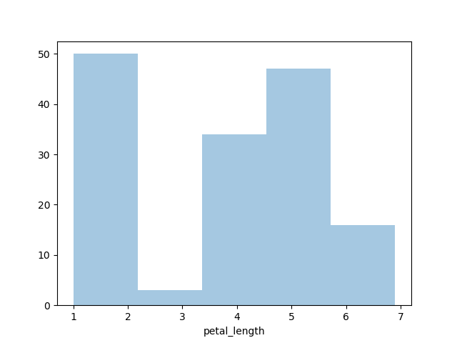 Here, kde flag is set as False. Therefore, the representation of the kernel estimation plot is removed and the only histogram is plotted.
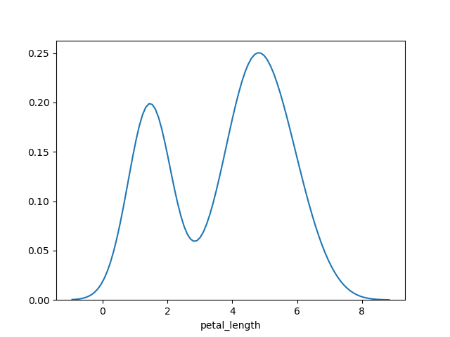
Kernel Density Estimates
Kernel Density Estimation (KDE) is used to estimate the probability density function (PDF) of a continuous random variable. It is used in the non-parametric analysis.
Setting up the hist flag to False value in a distplot will yield the kernel density estimation plot.
Ex) import pandas as pd
import seaborn as sb
from matplotlib import pyplot as plt
df = sb.load_dataset('iris')
sb.distplot(df['petal_length'],hist=False)
plt.show()
OutPut()
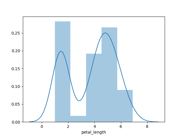
Fitting Parametric Distribution
distplot() is used to visualize the parametric distribution of a dataset.
Ex) import pandas as pd
import seaborn as sb
from matplotlib import pyplot as plt
df = sb.load_dataset('iris')
sb.distplot(df['petal_length'])
plt.show()
Output()
Plotting Bivariate Distribution
Bivariate Distribution is used to identify the relation between the two variables. This mainly deals with how one variable is behaving with respect to the other.
The best way to analyze Bivariate Distribution in seaborn is by using a jointplot() function.
Jointplot creates a multi-panel figure which projects bivariate relationship between two variables and univariate distribution of each variable on separate axes.
Scatter Plot
Scatter plot is most convenient way to display distribution where each observation is represented in a two-dimensional plot via x and y axis.
import pandas as pd
import seaborn as sb
from matplotlib import pyplot as plt
df = sb.load_dataset('iris')
sb.jointplot(x = 'petal_length',y = 'petal_width',data = df)
plt.show()
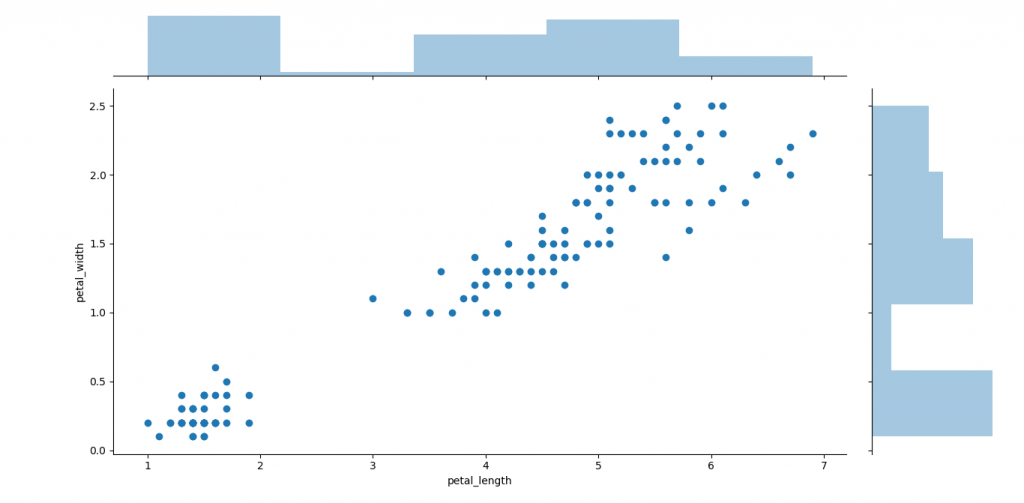 A trend in the plot displays a positive correlation exists between variables under study.
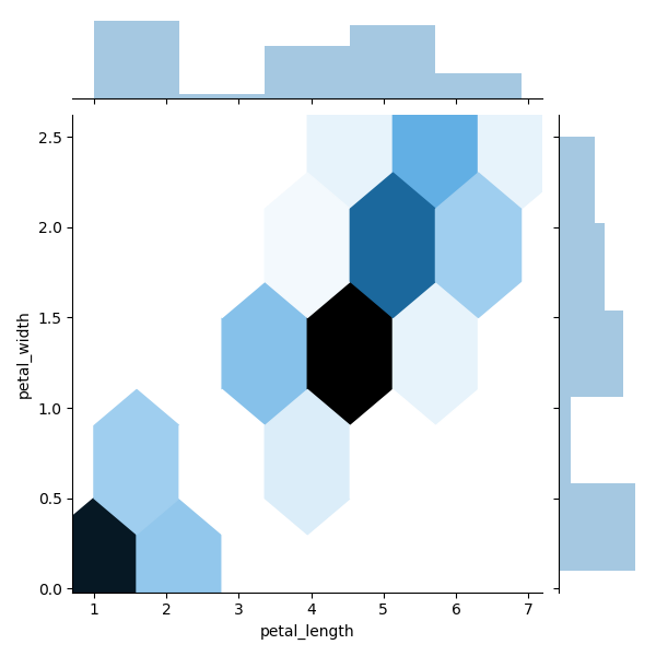
Hexbin Plot
Hexagonal binning is used in a bivariate data analysis when the dataset is sparse in density, which means when data is very scattered and difficult to analyze through scatterplots.
An addition parameter called ‘kind’ and value ‘hex’ plots a hexbin plot.
Ex) import pandas as pd
import seaborn as sb
from matplotlib import pyplot as plt
df = sb.load_dataset('iris')
sb.jointplot(x = 'petal_length',y = 'petal_width',data = df,kind = 'hex')
plt.show()
Output()
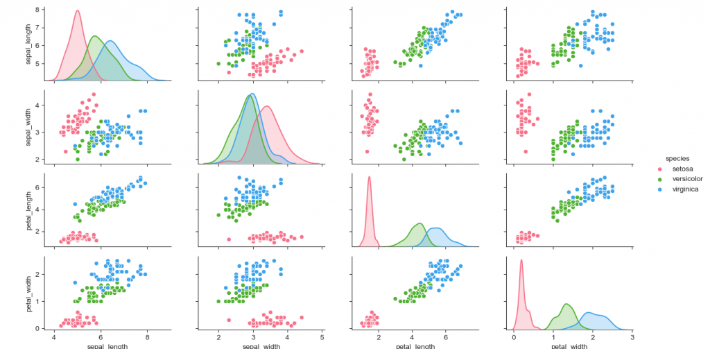
Seaborn - Visualizing Pairwise Relationship
Data under real-time study contain many variables. In such cases, the relation between each and every variable should be analyzed. Plotting Bivariate Distribution of (n,2) combinations will be a very complicated and time taking process.
In order to plot multiple pairwise bivariate distributions in a dataset, you may use the pairplot() function.
This shows the relationship for (n,2) a combination of the variable in a DataFrame as a matrix of plots and diagonal plots are the univariate plots.
Parameters
| Name |
Description |
| Data |
Dataframe |
| hue |
Variable in data to map plot aspects to different colors |
| palette |
Set of colors for mapping the hue variable |
| kind |
Kind of plot for the non-identity relationships. {‘scatter’, ‘reg’} |
| diag_kind |
Kind of plot for the diagonal subplots. {‘hist’, ‘kde’} |
Ex: import pandas as pd
import seaborn as sb
from matplotlib import pyplot as plt
df = sb.load_dataset('iris')
sb.set_style("ticks")
sb.pairplot(df,hue = 'species',diag_kind = "kde",kind = "scatter",palette = "husl")
plt.show()
Output()
Seaborn - Plotting Categorical Data
Scatter plots are not suitable when the variable under study is categorical.
When one or both variables under study are categorical, we use plots like striplot(), swarmplot(), etc, Seaborn provides an interface to do so.
Categorical Scatter Plots:
stripplot()
stripplot() is used when one of the variables under study is categorical. It presents the data in sorted order along any one of the axis.
import pandas as pd
import seaborn as sb
from matplotlib import pyplot as plt
df = sb.load_dataset('iris')
sb.stripplot(x = "species", y = "petal_length", data = df)
plt.show()
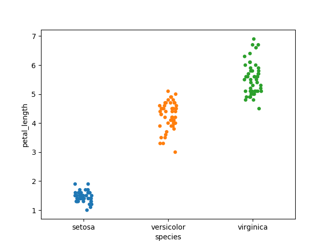 In the above graph, we can clearly view the difference of petal_length in each species. But, the major issue with the above scatter plot is that points on the scatter plot are overlapped. We use the ‘Jitter’ parameter to handle this kind of scenario.
import seaborn as sb
from matplotlib import pyplot as plt
df = sb.load_dataset('iris')
sb.stripplot(x = "species", y = "petal_length", data = df, jitter = True)
plt.show()
In the above graph, we can clearly view the difference of petal_length in each species. But, the major issue with the above scatter plot is that points on the scatter plot are overlapped. We use the ‘Jitter’ parameter to handle this kind of scenario.
import seaborn as sb
from matplotlib import pyplot as plt
df = sb.load_dataset('iris')
sb.stripplot(x = "species", y = "petal_length", data = df, jitter = True)
plt.show()
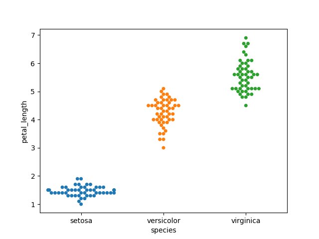
Swarmplot()
Another option which we can use as an alternative to ‘Jitter’ is a function swarmplot().
This function places each point of scatter plot over categorical axis and hence avoids overlapping points.
import seaborn as sb
from matplotlib import pyplot as plt
df = sb.load_dataset('iris')
sb.swarmplot(x = "species", y = "petal_length", data = df)
plt.show()
Seaborn - Distribution of Observations
In categorical scatter plots the approach becomes limited in the information, it can provide about the distribution of values within each category. Now, going further, let's see what facilitates us with the comparison within categories.
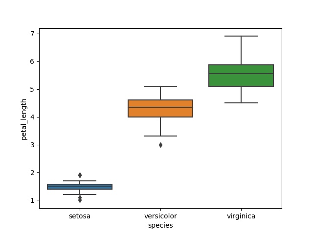
Box Plots
Boxplot is convenient to visualize the distribution of data through their quartiles.
Box plots normally have vertical lines extending from the boxes which are termed as whiskers. These whiskers denote variability outside the upper and lower quartiles, therefore Box Plots are also termed as box-and-whisker plot and box-and-whisker diagram. Any Outliers in data are plotted as individual points.
import seaborn as sb
from matplotlib import pyplot as plt
df = sb.load_dataset('iris')
sb.boxplot(x = "species", y = "petal_length", data = df)
plt.show()
Violin Plots
Violin Plots are a combination of both box plot with the kernel density estimates. So, these plots are easier to analyze and understand the distribution of the data.
import seaborn as sb
from matplotlib import pyplot as plt
df = sb.load_dataset('tips')
sb.violinplot(x = "day", y = "total_bill", data=df)
plt.show()
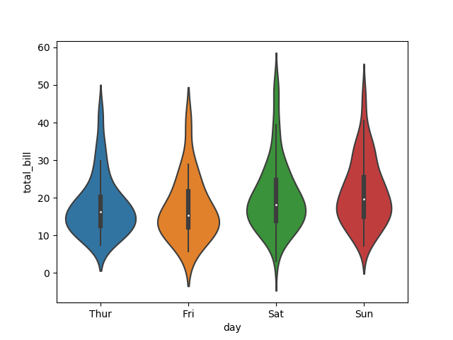 The quartile and whisker values from the boxplot are shown in the violin. As the violin plot uses KDE, the wider portion of the violin denotes higher density and the narrow region represents relatively lower density. The Inter-Quartile range in boxplot and higher density portion in kde lie in the same region of each category of the violin plot.
The above plot displays distribution of total_bill on four days of the week. But, in addition to that, if we want to see how distribution behaves with respect to sex, let's explore it:
import seaborn as sb
from matplotlib import pyplot as plt
df = sb.load_dataset('tips')
sb.violinplot(x = "day", y = "total_bill",hue = 'sex', data = df)
plt.show()
The quartile and whisker values from the boxplot are shown in the violin. As the violin plot uses KDE, the wider portion of the violin denotes higher density and the narrow region represents relatively lower density. The Inter-Quartile range in boxplot and higher density portion in kde lie in the same region of each category of the violin plot.
The above plot displays distribution of total_bill on four days of the week. But, in addition to that, if we want to see how distribution behaves with respect to sex, let's explore it:
import seaborn as sb
from matplotlib import pyplot as plt
df = sb.load_dataset('tips')
sb.violinplot(x = "day", y = "total_bill",hue = 'sex', data = df)
plt.show()
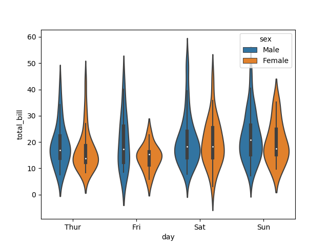 Now from the above, we can clearly visualize spending behavior between males and females. We can easily tell that; a man makes more bills than a woman by looking at the graph.
Seaborn - Statistical Estimation
In most of the scenarios, we deal with predictions of the whole distribution of the data. But when it comes to central tendency predictions, we require a specific way to summarize the distribution. Mean and median are the very regularly used techniques to predict the central tendency of the distribution.
In all the plots that we learned until now, we made the visualization of the whole distribution. Now, let us discuss the plots with which we can predict the central tendency of the distribution.
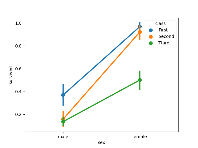
Bar Plot
The barplot() displays the relationship between a categorical variable and a continuous variable. The dataset is represented in rectangular bars where length the bar represents the proportion of the dataset in that category.
The bar plot indicates the estimate of central tendency. Let us use the ‘titanic’ dataset to learn bar plots.
import seaborn as sb
from matplotlib import pyplot as plt
df = sb.load_dataset('titanic')
sb.barplot(x = "sex", y = "survived", hue = "class", data = df)
plt.show()
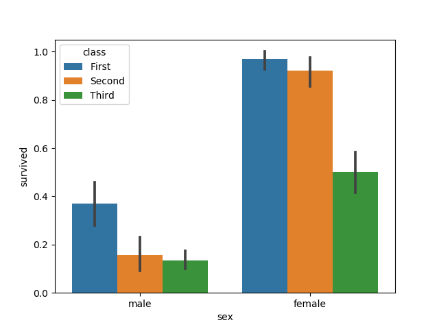 In this example, we can view the average quantity of survivals of males and females in each class. From the graph we can understand, more quantity of females survived than males. In both males and females, more quantity of survival is from the first class.
A special case in barplot is to visualize the no of observations in each category instead of computing a statistic for a second variable. For this, we use countplot().
import seaborn as sb
from matplotlib import pyplot as plt
df = sb.load_dataset('titanic')
sb.countplot(x =" class ", data = df, palette = "Blues");
plt.show()
In this example, we can view the average quantity of survivals of males and females in each class. From the graph we can understand, more quantity of females survived than males. In both males and females, more quantity of survival is from the first class.
A special case in barplot is to visualize the no of observations in each category instead of computing a statistic for a second variable. For this, we use countplot().
import seaborn as sb
from matplotlib import pyplot as plt
df = sb.load_dataset('titanic')
sb.countplot(x =" class ", data = df, palette = "Blues");
plt.show()
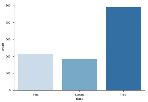 Plot clarifies that, number of passengers in third class are higher than first and second class.
Point Plots
Point plots are the same as bar plots but in a different style. Instead of the full bar, the value of the prediction is represented by the point at a certain height on the other axis.
import seaborn as sb
from matplotlib import pyplot as plt
df = sb.load_dataset('titanic')
sb.pointplot(x = "sex", y = "survived", hue = "class", data = df)
plt.show()
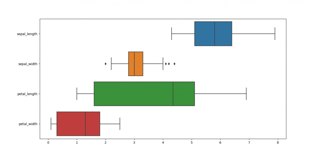
Seaborn - Plotting Wide Form Data
It is always preferred to use ‘long-from’ or ‘tidy’ datasets. But at times when we are left with no option other than to use a ‘wide-form’ dataset, same functions can also be implemented to “wide-form” data in a variety of formats, including Pandas Data Frames or two-dimensional NumPy arrays. These objects must be passed directly to the dataset parameter the x and y variables must be specified as strings
import seaborn as sb
from matplotlib import pyplot as plt
df = sb.load_dataset('iris')
sb.boxplot(data = df, orient = "h")
plt.show()
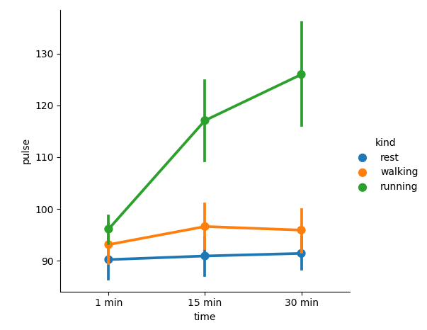
Seaborn - Multi Panel Categorical Plots
Categorical data can we displayed using two plots, you can either use the functions pointplot(), or the higher-level function factorplot().
Factorplot()
Factorplot plots a categorical plot on a FacetGrid. Using ‘kind’ parameter we can choose the plots like boxplot, violinplot, barplot and stripplot. FacetGrid uses pointplot by default.
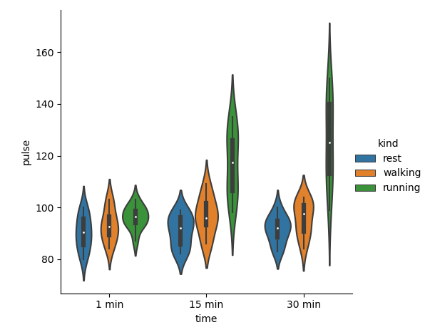
import seaborn as sb
from matplotlib import pyplot as plt
df = sb.load_dataset('exercise')
sb.factorplot(x = "time", y = "pulse", hue = "kind",data = df);
plt.show()
 We can use different plot to display same data using the kind parameter
import seaborn as sb
from matplotlib import pyplot as plt
df = sb.load_dataset('exercise')
sb.factorplot(x = "time", y = "pulse", hue = "kind", kind = 'violin',data = df);
plt.show()
We can use different plot to display same data using the kind parameter
import seaborn as sb
from matplotlib import pyplot as plt
df = sb.load_dataset('exercise')
sb.factorplot(x = "time", y = "pulse", hue = "kind", kind = 'violin',data = df);
plt.show()
What is Facet Grid?
Facet grid forms a matrix of panels defined by rows and columns by dividing the variables. Due to panels, a single plot looks like multiple plots. It is very helpful to analyze all combinations in 2 discrete variables.
import seaborn as sb
from matplotlib import pyplot as plt
df = sb.load_dataset('exercise')
sb.factorplot(x = "time", y = "pulse", hue = "kind", kind = 'violin', col = "diet", data = df);
plt.show()
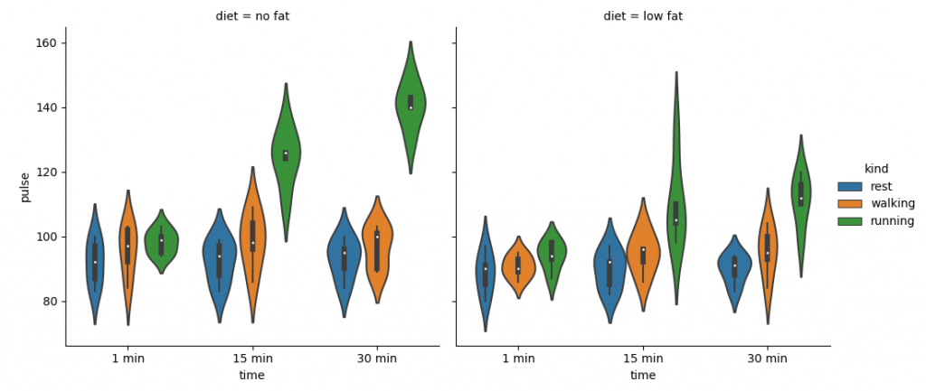 The facility of using Facet is, we can input another variable into the graph. The above graph is divided into two plots based on a third variable called ‘diet’ using the ‘col’ parameter.
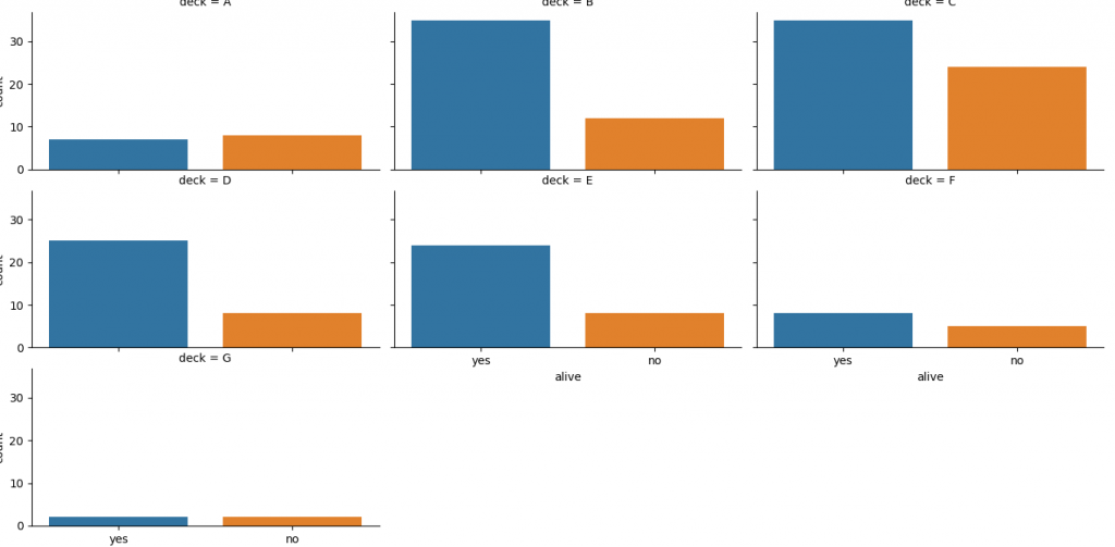
We can make many column facets and align them with the rows of the grid:
import seaborn as sb
from matplotlib import pyplot as plt
df = sb.load_dataset('titanic')
sb.factorplot("alive", col = "deck", col_wrap = 3,data = df[df.deck.notnull()],kind = "count")
plt.show()
The facility of using Facet is, we can input another variable into the graph. The above graph is divided into two plots based on a third variable called ‘diet’ using the ‘col’ parameter.
We can make many column facets and align them with the rows of the grid:
import seaborn as sb
from matplotlib import pyplot as plt
df = sb.load_dataset('titanic')
sb.factorplot("alive", col = "deck", col_wrap = 3,data = df[df.deck.notnull()],kind = "count")
plt.show()
 Mostly, we use data that contain multiple quantitative variables, and the goal of an analysis is to relate those variables to each other. This can be done by regression lines.
While building regression models, we normally check for multicollinearity, where we need to visualize the correlation between all the combinations of continuous variables and will take the required action to remove multicollinearity if exists. In such cases, the following techniques help.
Mostly, we use data that contain multiple quantitative variables, and the goal of an analysis is to relate those variables to each other. This can be done by regression lines.
While building regression models, we normally check for multicollinearity, where we need to visualize the correlation between all the combinations of continuous variables and will take the required action to remove multicollinearity if exists. In such cases, the following techniques help.
Functions to Draw Linear Regression Models
There are two main functions in Seaborn to visualize a linear relationship identified through regression.
They are regplot() and lmplot().
| regplot |
lmplot |
| accepts the x and y variables in a variety of formats includes simple numpy arrays, pandas Series objects, or as references to variables in a pandas DataFrame |
has a dataset as a required parameter and the x and y variables must be specified as strings. This data format is called “long-form” data |
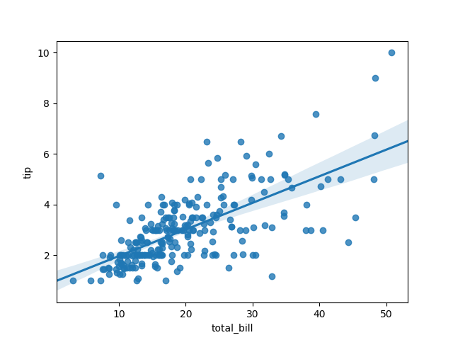
| import seaborn as sb
from matplotlib import pyplot as plt
df = sb.load_dataset('tips')
sb.regplot(x = "total_bill", y = "tip", data = df)
plt.show() |
import seaborn as sb
from matplotlib import pyplot as plt
df = sb.load_dataset('tips')
sb.lmplot(x = "total_bill", y = "tip", data = df)
plt.show() |
 |
 |
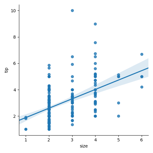
We can also fit a linear regression when one of the variables takes discrete values
import seaborn as sb
from matplotlib import pyplot as plt
df = sb.load_dataset('tips')
sb.lmplot(x = "size", y = "tip", data = df)
plt.show()
Fitting Different Kinds of Models
In most of the cases, the dataset is non-linear and the above methods cannot generalize the regression line.
Let us use Anscombe’s dataset with the regression plots:
import seaborn as sb
from matplotlib import pyplot as plt
df = sb.load_dataset('anscombe')
sb.lmplot(x = "x", y = "y", data = df.query("dataset == 'II'"))
plt.show()
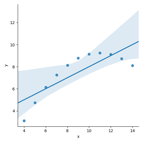 The plot displays the high deviation of data points from a regression line. These non-linear, higher order can be visualized using the lmplot() and regplot().These can fit a polynomial regression model to explore simple kinds of nonlinear trends in the datasets :
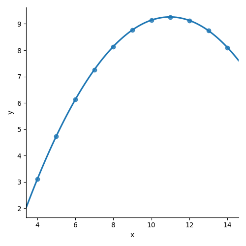
import seaborn as sb
from matplotlib import pyplot as plt
df = sb.load_dataset('anscombe')
sb.lmplot(x = "x", y = "y", data = df.query("dataset == 'II'"),order = 2)
plt.show()
The plot displays the high deviation of data points from a regression line. These non-linear, higher order can be visualized using the lmplot() and regplot().These can fit a polynomial regression model to explore simple kinds of nonlinear trends in the datasets :
import seaborn as sb
from matplotlib import pyplot as plt
df = sb.load_dataset('anscombe')
sb.lmplot(x = "x", y = "y", data = df.query("dataset == 'II'"),order = 2)
plt.show()
Seaborn - Facet Grid
A useful approach to understand medium-dimensional data is by drawing multiple instances of the same plot over different subsets of your dataset.
This technique is normally known as “lattice”, or “trellis” plotting, and it is related to the idea of “small multiples”.
To use these features, your data has to be in a Pandas DataFrame.
Plotting Small Multiples of Data Subsets
We have already seen the FacetGrid example where FacetGrid class helps in displaying the distribution of one variable as well as the relationship between multiple variables separately within subsets of your dataset using multiple panels.
A FacetGrid could be drawn with up to three dimensions − rows, cols, and hue. The first 2 have obvious correspondence with the resulting array of axes; think of the hue variable as the third dimension along a depth axis, where different levels are graphed with different colors.
FacetGrid object takes a data frame as input and the names of variables that will form a row, column, or hue dimensions of the grid.
Variables must be categorical and data at each level of the variable will be used for a facet along that axis.
import seaborn as sb
from matplotlib import pyplot as plt
df = sb.load_dataset('tips')
g = sb.FacetGrid(df, col = "time")
plt.show()
 Here we have just initialized the facet grid object which doesn’t draw anything over them.
The main approach for displaying data over this grid is with the FacetGrid.map() method. Let’s visualize the distribution of tips in each of these subsets, using a histogram.
import seaborn as sb
from matplotlib import pyplot as plt
df = sb.load_dataset('tips')
g = sb.FacetGrid(df, col = "time")
g.map(plt.hist, "tip")
plt.show()
Here we have just initialized the facet grid object which doesn’t draw anything over them.
The main approach for displaying data over this grid is with the FacetGrid.map() method. Let’s visualize the distribution of tips in each of these subsets, using a histogram.
import seaborn as sb
from matplotlib import pyplot as plt
df = sb.load_dataset('tips')
g = sb.FacetGrid(df, col = "time")
g.map(plt.hist, "tip")
plt.show()
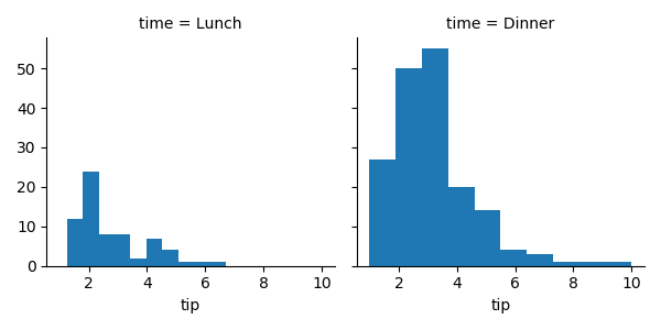 The no of plots is more than one because of the parameter col.
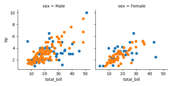
To make a relational plot, pass the multiple variable names.
import seaborn as sb
from matplotlib import pyplot as plt
df = sb.load_dataset('tips')
g = sb.FacetGrid(df, col = "sex", hue = "smoker")
g.map(plt.scatter, "total_bill", "tip")
plt.show()
The no of plots is more than one because of the parameter col.
To make a relational plot, pass the multiple variable names.
import seaborn as sb
from matplotlib import pyplot as plt
df = sb.load_dataset('tips')
g = sb.FacetGrid(df, col = "sex", hue = "smoker")
g.map(plt.scatter, "total_bill", "tip")
plt.show()
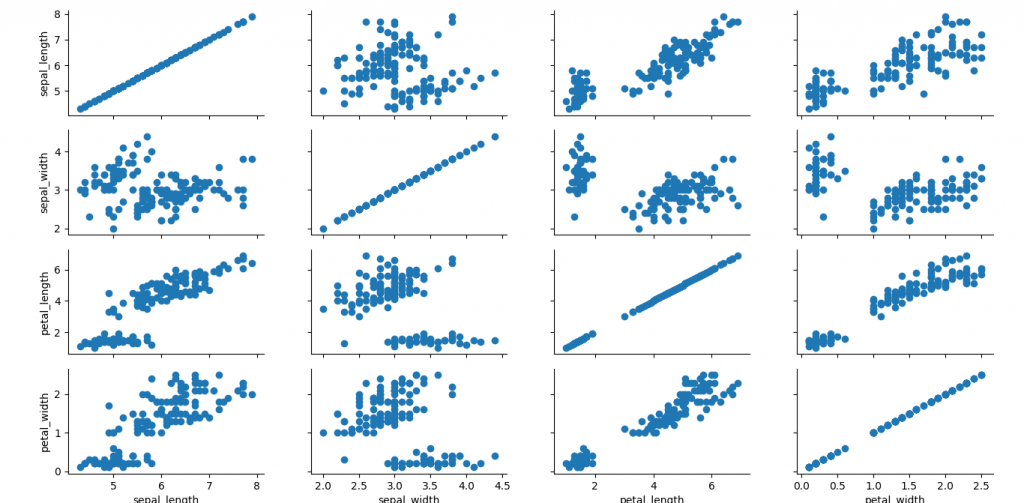
Seaborn - Pair Grid
PairGrid allows us to plot a grid of subplots using same plot type to visualize a dataset.
Unlike FacetGrid, it uses a different pair of variables for every subplot. It creates a matrix of sub-plots. It is also called a “scatterplot matrix”.
The usage of pairgrid is similar to facetgrid. First initialise the grid and then pass plotting function.
import seaborn as sb
from matplotlib import pyplot as plt
df = sb.load_dataset('iris')
g = sb.PairGrid(df)
g.map(plt.scatter);
plt.show()
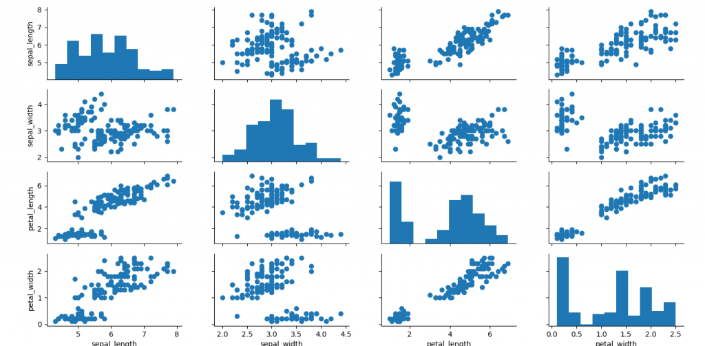
 It is also possible to plot different functions on the diagonal to show the univariate distribution of variable in each column.
import seaborn as sb
from matplotlib import pyplot as plt
df = sb.load_dataset('iris')
g = sb.PairGrid(df)
g.map_diag(plt.hist)
g.map_offdiag(plt.scatter);
plt.show()
It is also possible to plot different functions on the diagonal to show the univariate distribution of variable in each column.
import seaborn as sb
from matplotlib import pyplot as plt
df = sb.load_dataset('iris')
g = sb.PairGrid(df)
g.map_diag(plt.hist)
g.map_offdiag(plt.scatter);
plt.show()
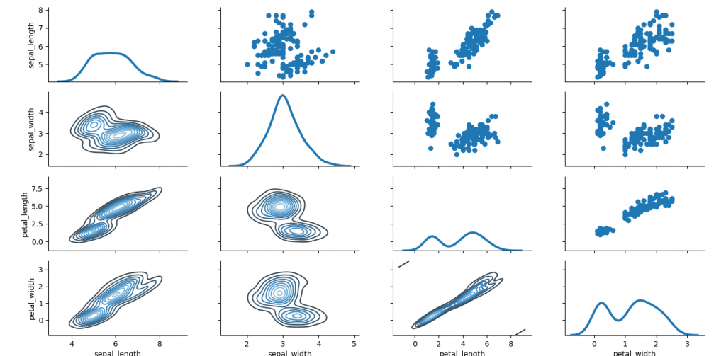
 We can use different functions in the upper and lower triangles to view different aspects of relationship.
import seaborn as sb
from matplotlib import pyplot as plt
df = sb.load_dataset('iris')
g = sb.PairGrid(df)
g.map_upper(plt.scatter)
g.map_lower(sb.kdeplot, cmap = "Blues_d")
g.map_diag(sb.kdeplot, lw = 3, legend = False);
plt.show()
We can use different functions in the upper and lower triangles to view different aspects of relationship.
import seaborn as sb
from matplotlib import pyplot as plt
df = sb.load_dataset('iris')
g = sb.PairGrid(df)
g.map_upper(plt.scatter)
g.map_lower(sb.kdeplot, cmap = "Blues_d")
g.map_diag(sb.kdeplot, lw = 3, legend = False);
plt.show()
We hope you understand sets in Python Data Visualisation using Seaborn concepts.Get success in your career as a
Python developer by being a part of the
Prwatech, India's leading
Python training institute in Bangalore.