Map
Power BI Map Tips and Tricks
Power BI’s Map visual, sometimes called a bubble map, plots a circle at each geographic location in your data, with the size of the circle showing a value. It is one of the simplest ways to see where something is happening across a region, and small formatting choices make a real difference in how clearly it communicates that.
Getting Your Location Data Right
The Map visual needs a field it can recognize as a real place, such as a country, state, city, or postal code, or a pair of latitude and longitude fields if you have exact coordinates. Coordinates are more accurate when you have them, since they skip the geocoding step entirely, but a clear place name works well for most everyday reports. Avoid mixing both approaches for the same field unless you need to, since it adds ambiguity rather than removing it.
Step by Step Process of Creating MAP in Power BI
Step 1: Add a Map to the Report
In the Visualizations pane, click the Map icon. This adds an empty map visual to the report canvas. canvas.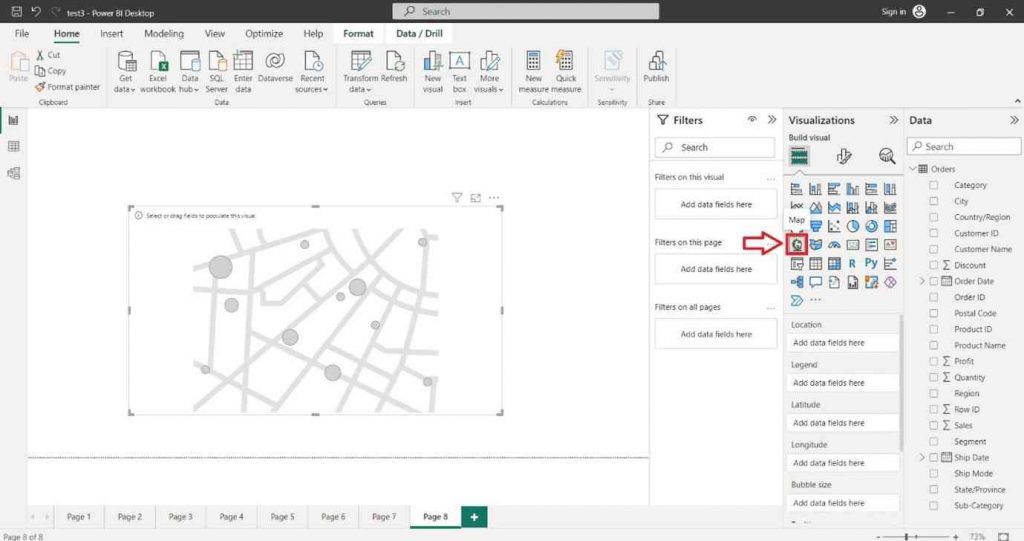
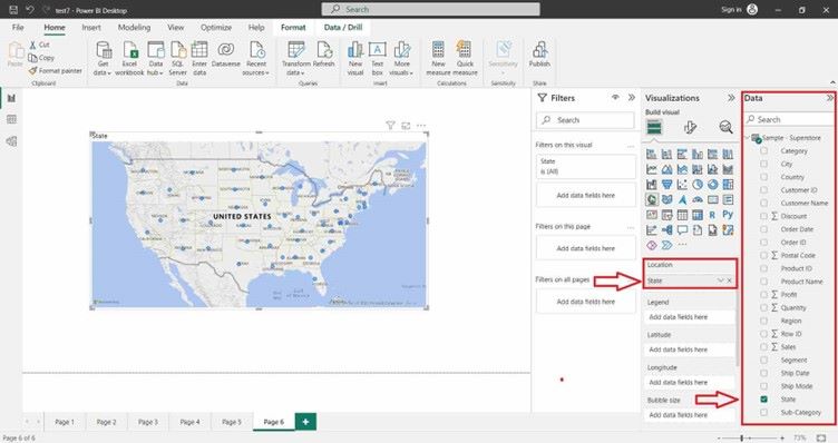
Step 2: Add a Field to Location
Drag your geographic field, such as country, state, or city, into the Location section. This places a bubble on the map for each value.
Step 3: Add a Field to Bubble Size
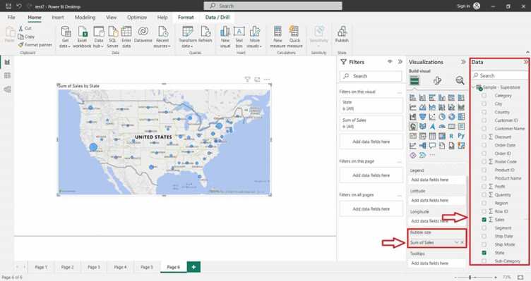
Drag the number you want to measure, such as sales or order count, into the Bubble Size section. Larger values show up as larger bubbles.
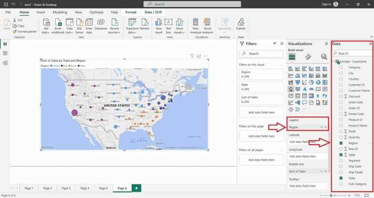
Step 4: Add a Field to Legend
You can also drag a categorical field into the Legend section. On this visual, that turns each bubble into a small pie chart split by category. If that pie behavior is what you are after, the Map with Pie Chart guide covers it in more depth, including its data and category limits.
Formatting Tips That Make a Real Difference
- Map style: in the Format pane under Map settings, switch the Style between Road, Aerial, Dark, Light, and Grayscale. A lighter or grayscale theme usually makes colored bubbles stand out more than the default Road style.
- Auto zoom: by default, the map zooms to fit all your data points every time the page loads, which can reset a view you carefully set up. Turn this off in Map controls if you want the map to stay focused on a specific region instead.
- Tooltips: drag extra relevant fields, such as profit or order count, into the Tooltips section so hovering over a bubble shows more than just its size at a glance.
Handling a Large or Cluttered Map
The Map visual can plot up to about 3,500 data points before Power BI automatically samples your data and only shows a subset, silently, without any warning. Past a few hundred locations, the map can also start to look cluttered even before you hit that limit.
- Add slicers so viewers can filter the map down to a specific region, year, or category rather than seeing every point at once.
- Consider the Heat map formatting option if you have many overlapping points and only need to show where activity is concentrated, rather than plotting every single point individually.
- Filter out genuinely insignificant data points in the Filters pane rather than relying on the visual to sample for you.
Map Compared to Filled Map and Map with Pie Chart
Power BI’s three closely related geographic visuals each answer a slightly different question. The plain Map visual plots individual points and is the right choice when your data describes specific locations, such as stores or delivery addresses. A Filled Map shades entire regions instead of plotting points, and fits data that is naturally tied to a whole area, such as sales by state. A Map with Pie Chart takes the plain Map further by splitting each bubble into a category breakdown, which is useful when you need both the location and its composition in a single visual, at the cost of extra visual complexity.
That covers the core tips for building clearer map visualizations in Power BI. To keep building out your report with other map types, explore Prwatech’s Power BI training program, which includes placement assistance.
