Map with Pie Chart
Map with Pie Chart
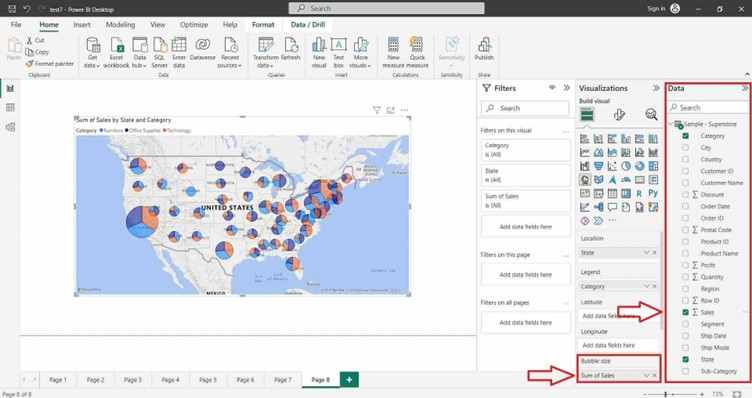
This approach enhances the effectiveness of data visualization in exploring spatial data and supporting data-driven decision-making processes.
Power BI Desktop
Creating Map in Power BI Desktop using the loaded dataset. To create a Map in Power BI Desktop you need a Geographical data type like Country, State, City etc…, In this Dataset there is already the Geographical data type values are available, check your Dataset then create the Map. Click on the “Map” icon. This will add an empty Map visual to the report canvas.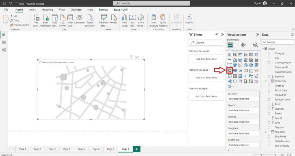
In the “Visualizations” pane on the right side, locate the dataset fields you want to use for the column chart. Select the Geographical data type like Country, State, City etc…, into the “Location” section of the “Visualizations” pane.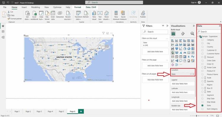
To increase or decrease the Bubble Size inside the map click on Format icon and then click on Bubble then adjust the size appropriately.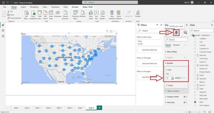
To create a Map with Pie Chart, you can select the appropriate field into the “Legend” section of the “Visualizations” pane.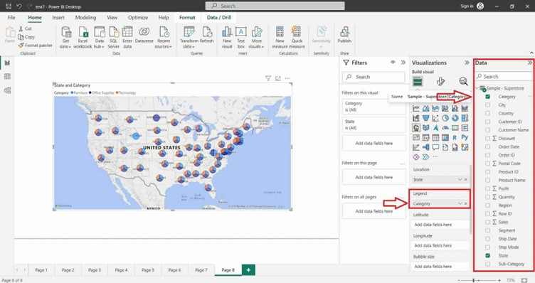
Select the desired field into the “Bubble Size” section of the “Visualizations” pane.