Map
Tips and tricks for Power BI map visualizations
Power BI map visualizations offer a powerful way to visualize geographic data and gain insights into spatial patterns and trends. Whether analyzing sales territories, customer locations, or operational data, maps provide a compelling and intuitive visualization tool for exploring data in a geographical context.
To make the most out of Power BI map visualizations, it’s essential to understand the various features and capabilities available and to apply best practices for effective data visualization.
One tip is to ensure that the data being visualized is properly formatted with geographic attributes such as latitude and longitude coordinates or addresses. This enables Power BI to accurately plot data points on the map and display spatial relationships effectively.
Another tip is to leverage the built-in mapping capabilities of Power BI, such as the ability to customize map styles, add layers for additional context, and use tooltips to display additional information when hovering over data points.
Creating Map in Power BI Desktop using the loaded dataset. To create a Map in Power BI Desktop you need a Geographical data type like Country, State, City etc…, In this Dataset there is already the Geographical data type values are available, check your Dataset then create the Map. Click on the “Map” icon. This will add an empty Map visual to the report canvas.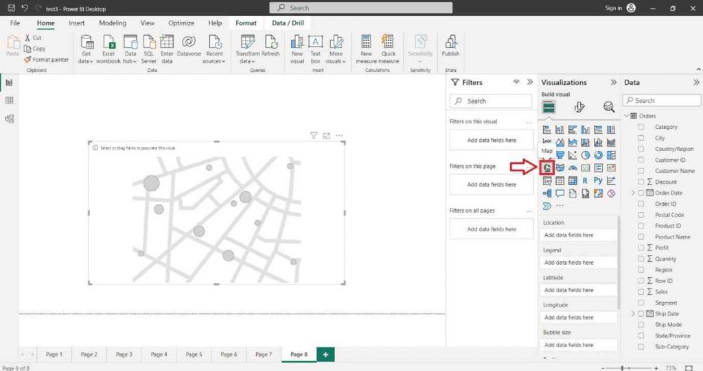
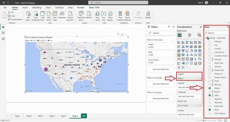
In the “Visualizations” pane on the right side, locate the dataset fields you want to use for the column chart. Select the Geographical data type like Country, State, City etc…, into the “Location” section of the “Visualizations” pane.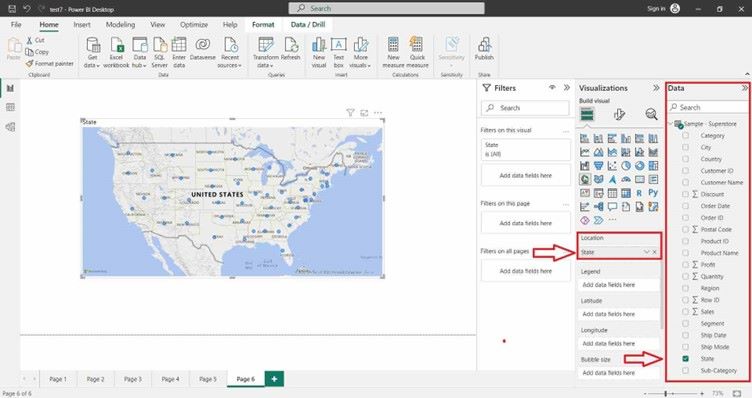
Select the desired field into the “Bubble Size” section of the “Visualizations” pane.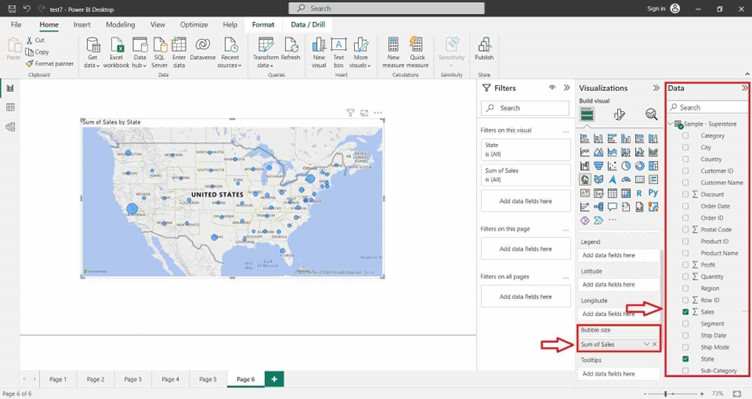
You can also select the desired field into the “Legend” section of the “Visualizations” pane.