Line Charts in Tableau
Tableau Line Charts Tutorial
The Below mentioned Tutorial will help to Understand the detailed information about tableau text table. So just follow all the tutorials of India’s leading Best Tableau Training institute in Bangalore and Be a Pro Tableau Developer.
Line Chart is the representation of data points by segments of straight lines. The data points are known as Markers. Line Chart is also known as Line Graph or Line Plot. It is very useful in the analysis of trends.
Let’s explore Line Charts in Tableau. Here we have used Sample EU Superstore data provided by Tableau by default.
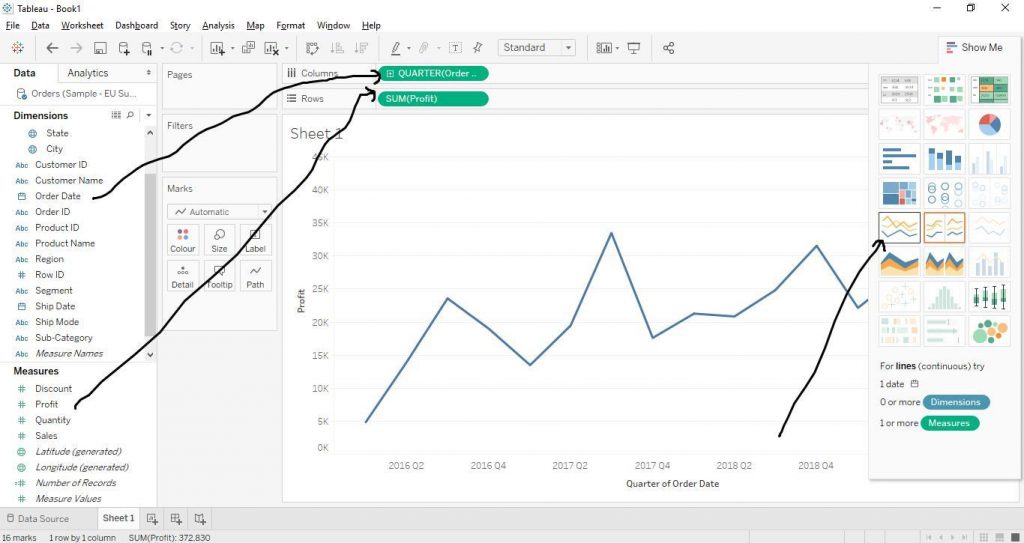
Drag Order Date from Dimensions section to Columns and Profit from Measures to Rows. Click on Order Date from Columns to change it to quarters. Click on Lines Chart from Show Me section to create Line Chart as shown by the diagram below.
Let’s make some more customised graphs with Line Charts.
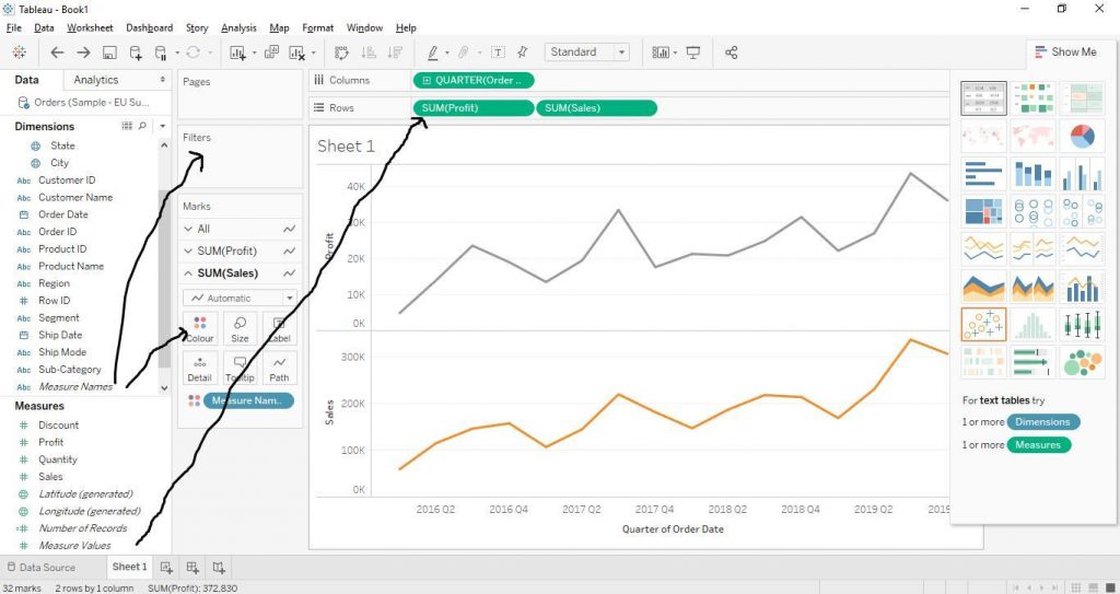
Multiple Measures Line Chart
Drag Order Date from Dimensions section to Columns and Measure Values from Measures section to Rows. Again, drag Measure Names from Dimensions section to Filters Card and choose the Measures variables (we have chosen Profit and Sales here). Also, drag Measure Names to Colour in Marks Card. The diagram below shows the step.
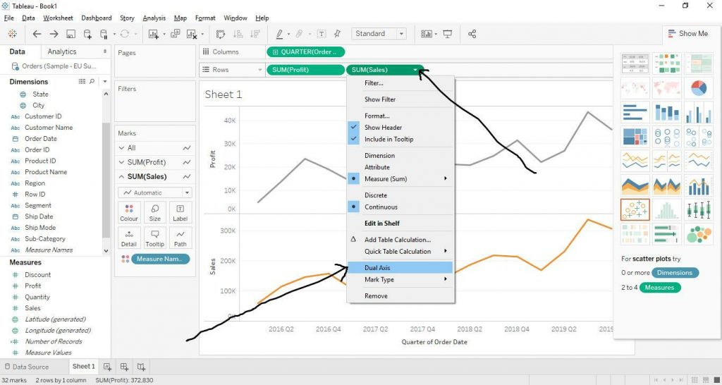
Now click on the little arrow on Sales from Rows and select Dual Axis as shown below by the arrows in the diagram.
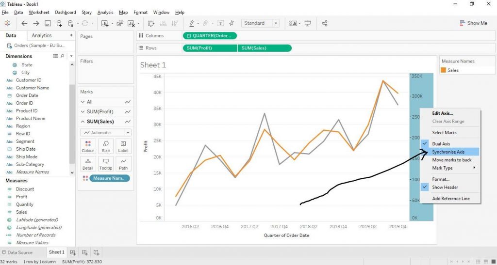
Now, right click on axis on the right hand side and click on Synchronise Axis as shown in the diagram below.
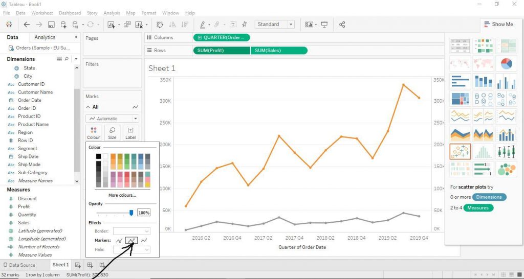
The Now to enhance the markers, click on Colour and click on Markers and select the second option and finally the Line Chart with multiple Measures and enhance Markers is create as shown below in the diagram.
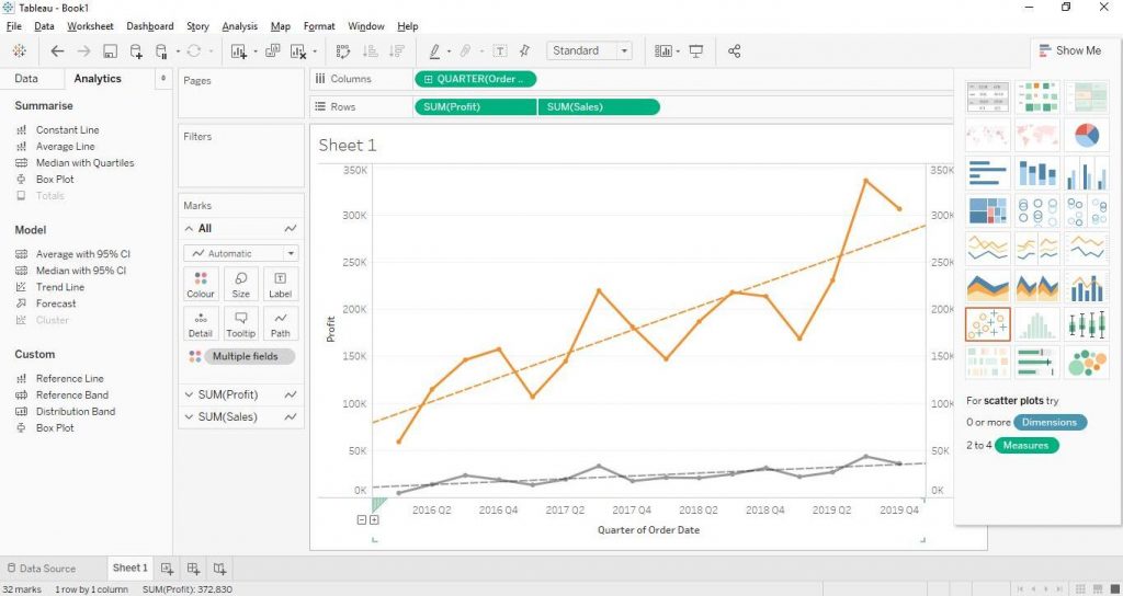
Line Chart with Trend Lines
To add trend lines to Line Charts, go to Analytics tab; drag Trend Line from Model section to Linear option as shown in the diagram below.
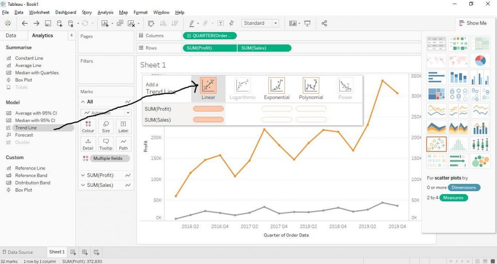
Now the Trend Lines to the Chart get add which helps in understanding the trend of the given data. The diagram below demonstrates the step.