What is a scatter plot used for?
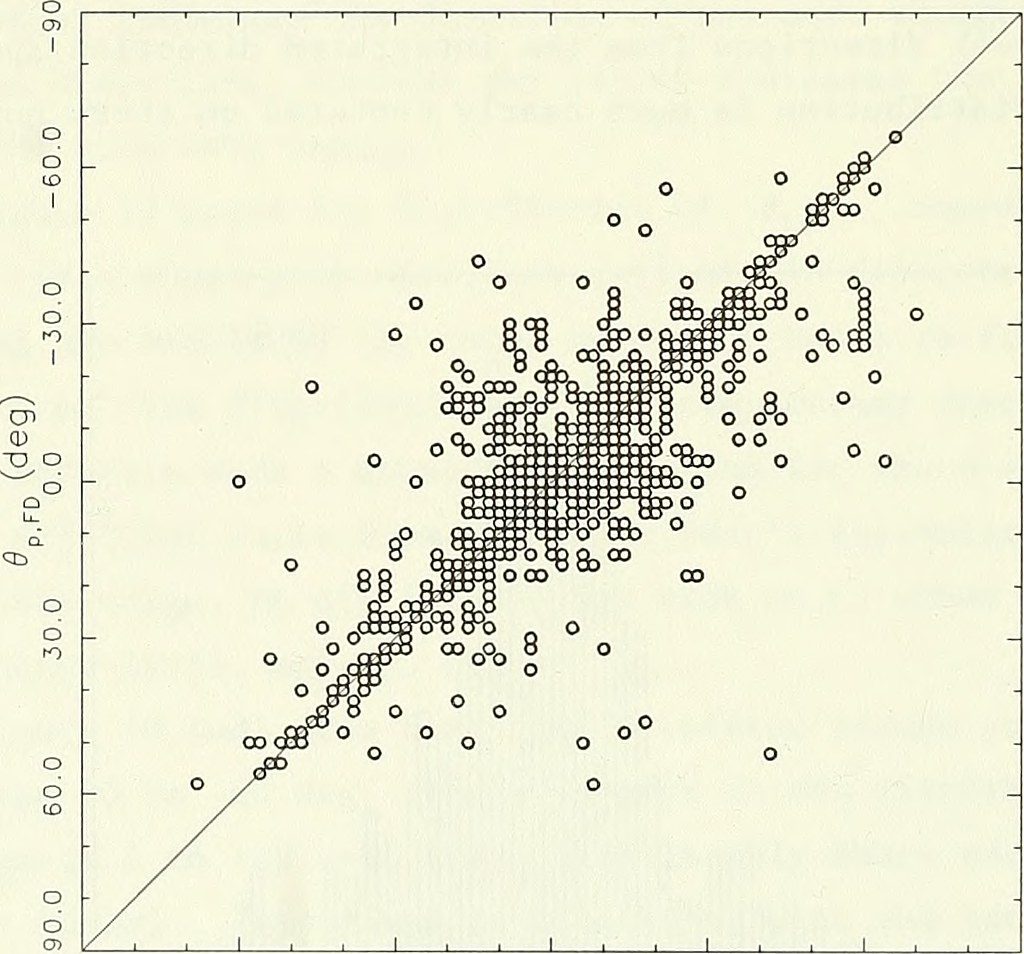
If the graph obtained is somewhat going upward from left bottom to top right corner, it indicates that there is positive correlation between variables, i.e., if one the value of one variable goes up, then the value of other variable also goes up. The diagram below demonstrates positive correlation among the data in the scatter plot.
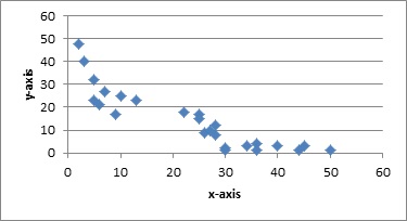
Again, if the graph obtained is somewhat going downward from left top corner to bottom right corner, it indicates that there is negative correlation between variables, i.e., if one the value of one variable goes up, then the value of other variable goes down. The diagram below demonstrates negative correlation among the data in the scatter plot.
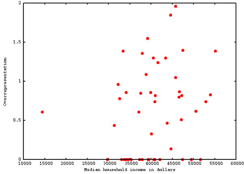
If the scattered plot is diffused all over the graph, it shows that there is very little or no correlation among the variables, i.e., if value of one variable goes up, the value of other variable remains unaffected, it may either go up or down or even remain constant. The diagram below shows the scatter plot with zero correlation among the variables.
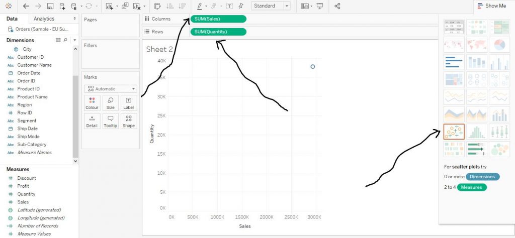
Let’s explore Scatter Plots in Tableau. Here, we have used Sample EU Superstore data which is provided by Tableau by default.
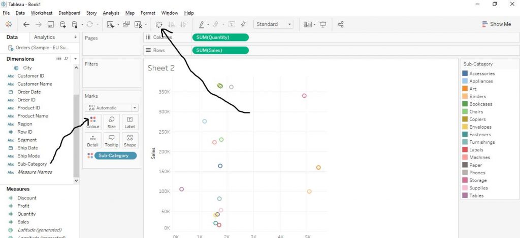
Drag the variable ‘Quantity’ from Measures section to Columns and again drag Sales from Measures section to Rows and click on Scatter plots from Show Me. The arrows in the diagram below show the step.
Now drag Sub Category from Dimensions Colour in the Marks Card. Now it helps to create a scatter plot on the basis of quantity and sales with regard to sub category. We have swapped axes of the graph. The arrows in the diagram below show the same.
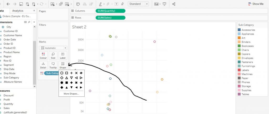
We can also customise the graph. We can change the shapes of the plot.Click on Shape from marks card as shown by the arrow in the diagram. Choose any of the shapes according to your choice and click on it. The diagram below explains the step.
The shape of the plot has now changed to filled circles as shown in the diagram below.
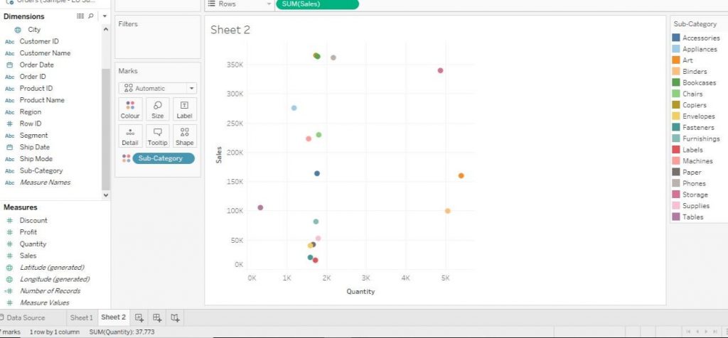
The scatter plot here shows that there is not much of correlation among the variables as per the dataset.

