Tableau Pie Chart Tutorial
Tableau Pie Chart Tutorial, in this Tutorial one, you can learn about Pie chart in tableau. Are you the one who is looking for the best platform which provides information about how to make a Pie Chart in Tableau? Or the one who is looking forward to taking the advanced Certification Course from India’s Leading
Tableau Training Institute? Then you’ve landed on the Right Path.
The Below mentioned Tutorial will help to Understand the detailed information about Pie Chart in Tableau. So just follow all the tutorials of India’s leading
Best Tableau Training institute in Bangalore and Be a Pro
Tableau Developer.
Pie Chart in Tableau
Pie Chart is a circular graph which represents data pictorially. The fragments in the chart represent the proportion of each category to the whole. Each fragment of the pie chart is relative to the size of that category in the entire cluster as a whole. The slices represents the proportions of the whole while the pie represents hundred per cent of a whole.
How to make a Pie Chart in Tableau?
Let’s explore the graph in the following steps. We have used the Sample EU Superstore data which has been provided by Tableau itself by default.
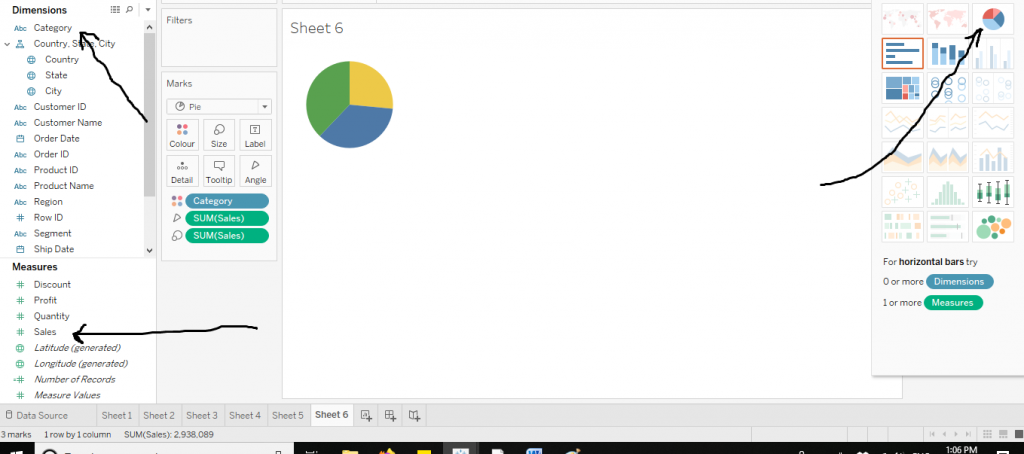
Drag a variable from Dimensions section (we have selected Category here) to Columns and a variable from Measures section (here we have selected Sales) to Rows. Now from Show Me section, click on the Pie Charts. The arrows in the diagram below explain the same.
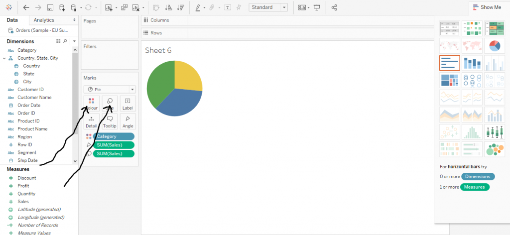
Let’s now customise the graph. We can increase the size and change colours from the Marks section.
The diagram below shows the same.
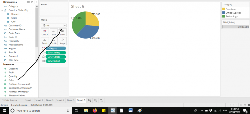
We can also add labels to the chart by dragging the variable to the Label in the Marks section. The diagram below demonstrates the same.
Let’s now move to some derived charts from the pie charts itself.
The most popular charts among them would be :
Doughnut Chart–A chart derived from two pie charts.
Lollipop Chart – A derived chart which is an amalgamation of pie chart and bar graph.
Let’s explore them one by one.
Doughnut Chart
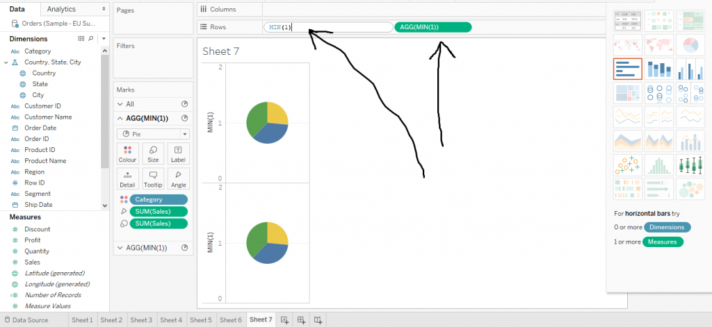
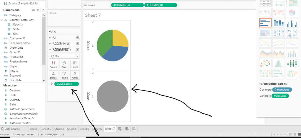
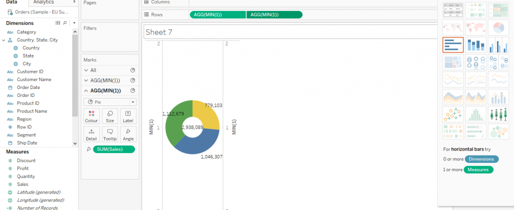
Follow the steps of creating a Pie Chart. Then in the Rows, double click and write the formula (MIN(1)) twice side by side. Then two pie charts would be created. The arrows in the diagram depict the same.
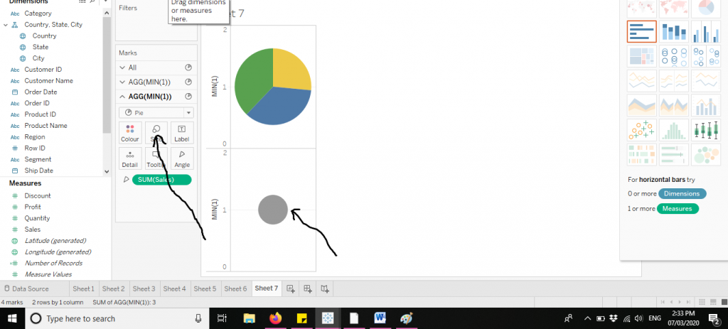
Now click on the second Min function. Drag off the Colour and Size cards from the Marks section. The diagram below demonstrates the same.
Now click on the second Min function and decrease the size as shown in the diagram below.
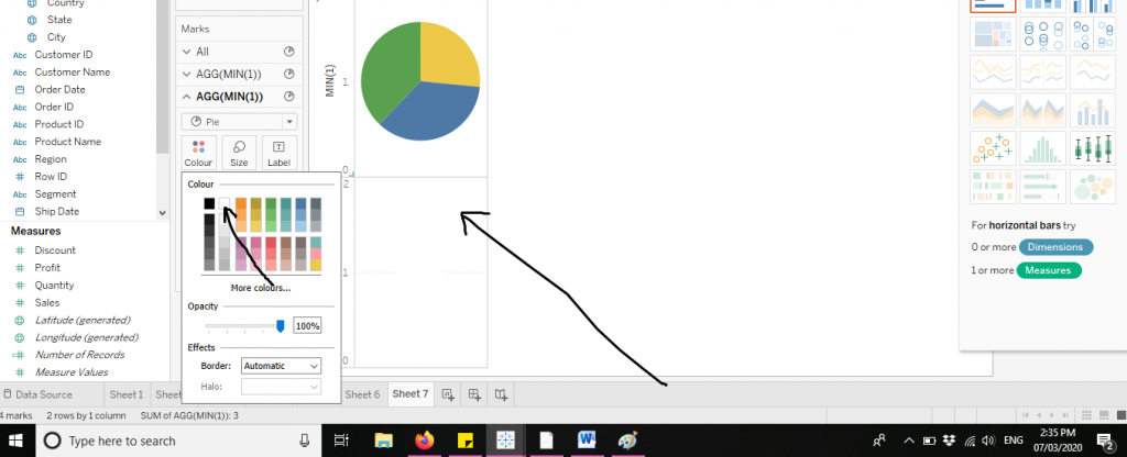
Again, click on the second Min function and choose the colour white as shown below in the diagram.
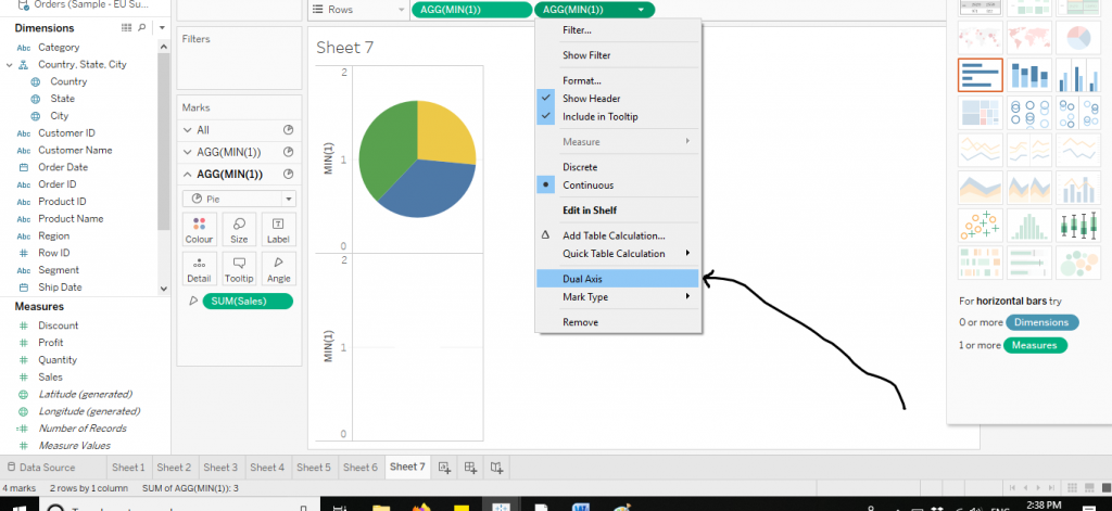
Now to merge the two graphs, click on the arrow of the little second Min function. Click on Dual Axis. The diagram below shows the same.
The doughnut chart is now created. You can also add labels to it for better readability purposes. The diagram below depicts the doughnut chart.
Lollipop Chart
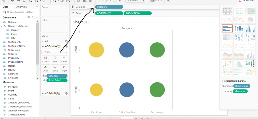
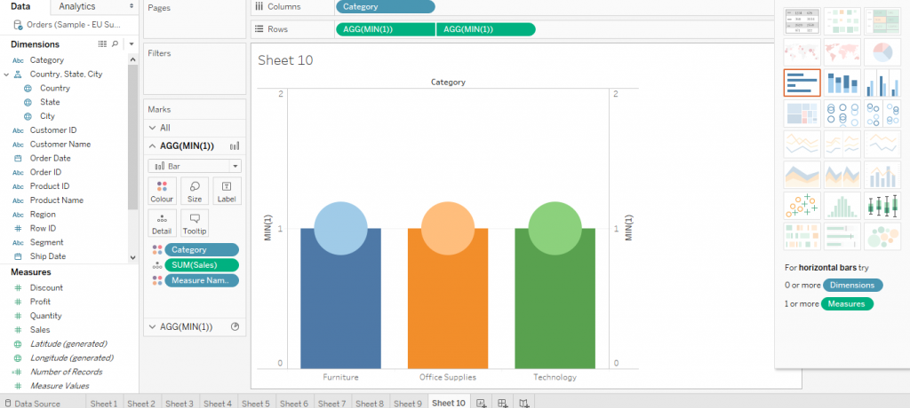
Follow the steps to create pie chart. Now make two pie charts using Min function on Rows. Then drag the variable Category to Columns. The figure below shows the same.
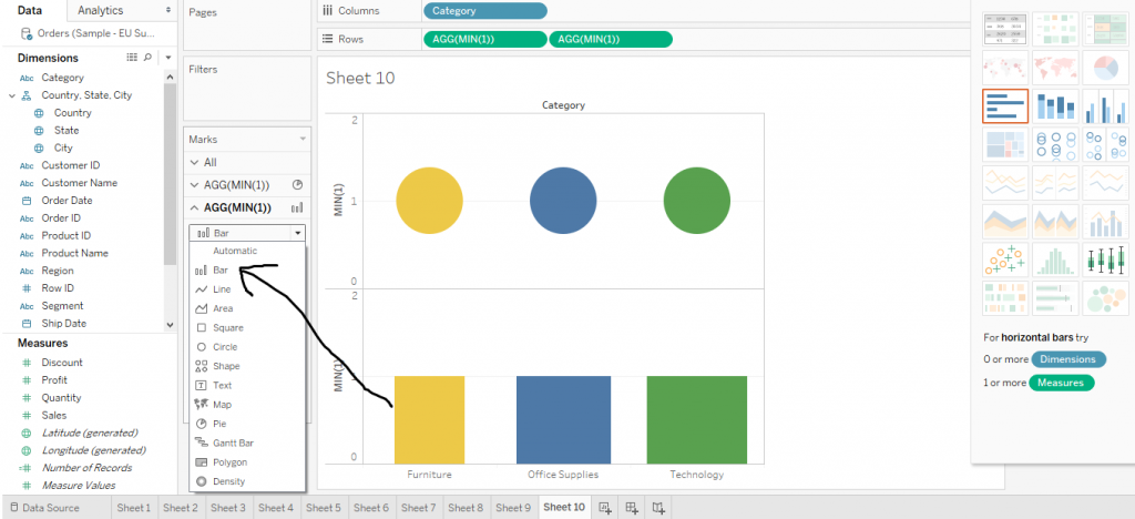
Now click in on the second Min function on Columns. And then change the pie chart to bar chart from Marks card as shown below in the diagram.
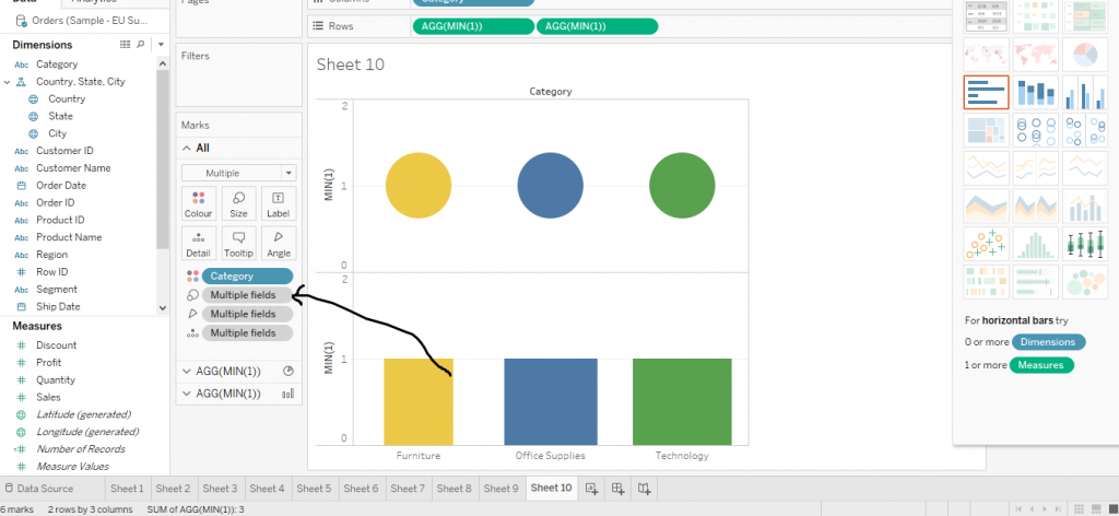
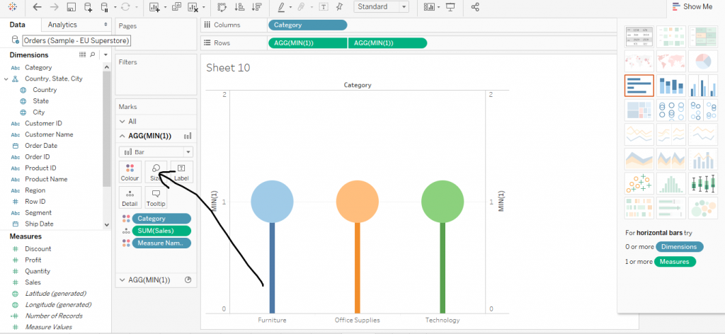
Now click on ‘All’ from the Marks Section and drag off Multiple fields from the Size. The diagram below shows the same.
Now merge the two graphs by dual axis and interchange the positions of Min functions from Rows as shown in the diagram.
Now click on the first Min function from Rows and decrease the size from Marks section to create Lollipop Chart as shown below in the diagram.
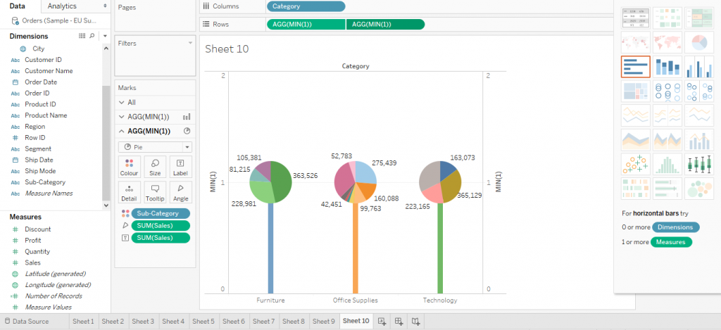
Again, click on second Min function. Then drag Sub Category from Dimensions to Colour in Marks. Also, labels can be also added. This is demonstrated by the figure given below.
This is the detail information of about how to make a Pie Chart in tableau. I hope you understand our Tableau pie chart tutorial and will helpful to you. If you have any queries, mention them in below comment section. If you wish to master in Tableau, Get trained for
Tableau course by
Prwatech, India's largest E-learning Platform.

