Maps Chart in Tableau
Maps Chart in Tableau
Tableau Maps Chart Tutorial, in this Tutorial one, you can learn about tableau maps chart. Are you the one who is looking for the best platform which provides information about how to create maps chart in tableau? Or the one who is looking forward to taking the advanced Certification Course from India’s Leading Tableau Training in Bangalore? Then you’ve landed on the Right Path.
The Below mentioned Tutorial will help to Understand the detailed information about tableau maps chart. So just follow all the tutorials of India’s leading Best Tableau Training institutes in Bangalore and Be a Pro Tableau Developer.
Tableau is already pre packaged with millions of coordinates with regard to latitudes and longitudes from all the areas over the globe. So it becomes very easy to portray the geographic charts on Tableau. Data Visualisations created on Tableau using maps looks highly professional and attractive. Maps come very handy especially while plotting demographic data such as population employment, GDP of different countries, countries affected in a pandemic, population literacy rates, incomes, state wise sex ratio and so on.
Let’s explore Maps Chart on Tableau in detail. Here, we have used Sample EU Superstore data for the creation of different types of charts and further customisations which is provided by Tableau by default.
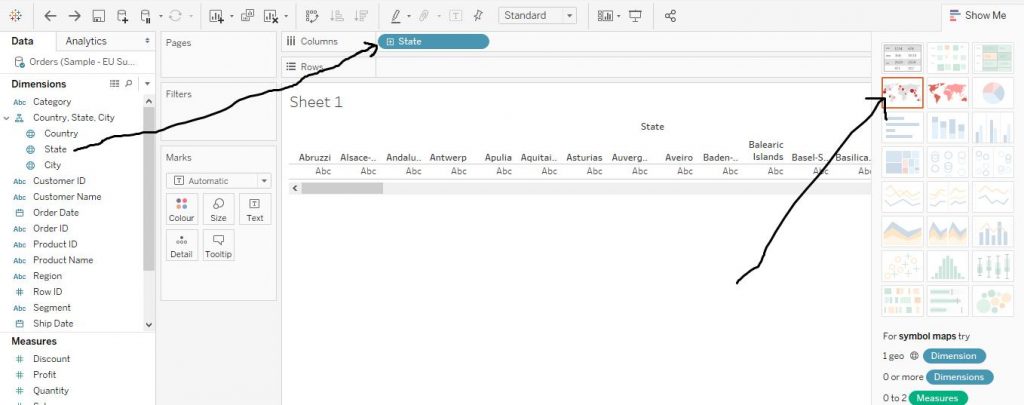
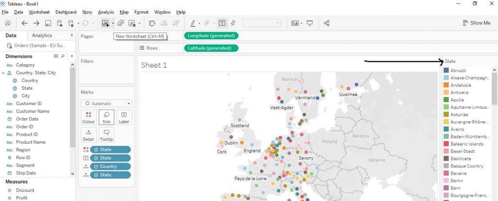
Drag the State variable from the Dimensions section to the Columns shelf. Then from the Show Me section, click on click on Maps. The arrows in the diagram given below explain the step.
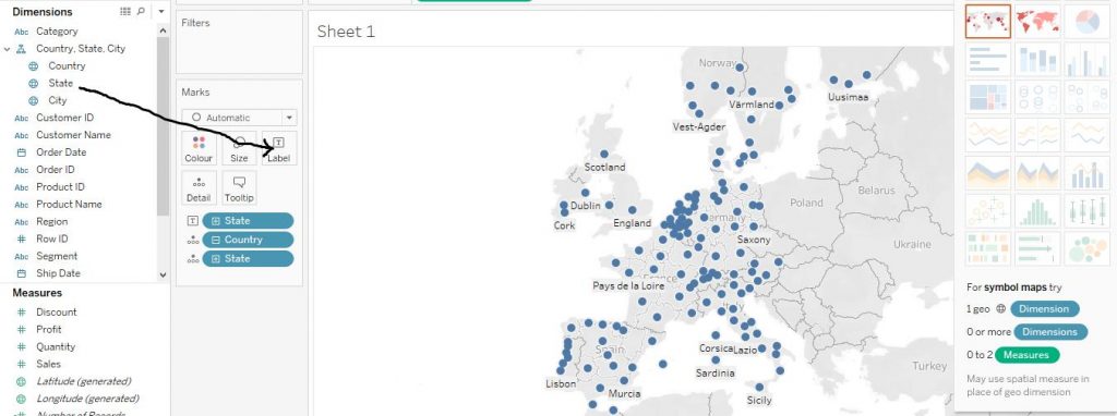
Again, drag the States variable from Dimensions section to Label in the Marks card. This adds the names of the states to the chart and thus makes it more readable to the audience. The arrow in the diagram given below helps to understand the step.
Further, drag the variable State from the Dimensions section to the Colour in the Marks Card. The arrow in the diagram given below demonstrates the step.
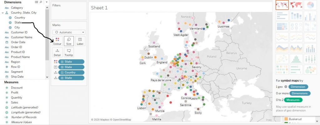
Now, the names of the states which are not shown in the chart due to lack of space is captured in the palette with regard to different colours as per different states. The diagram given below shows clarifies the step.
To add a Measure variable
Now to check the performance of different regions as per a particular parameter, we add the Measure variable effects as per the requirement.
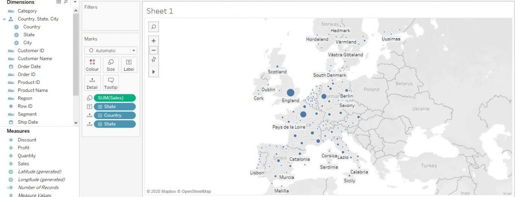
Suppose we want to check the amount of Sales across different regions. Now in order to do that, drag the variable Sales from Measures section to the Size in the Marks Card. The arrow in the diagram given below would help to understand the step.
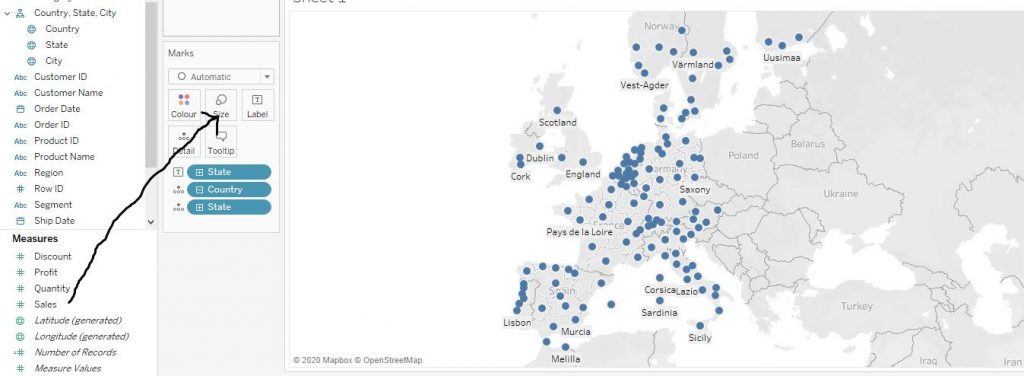
Now, the dots would indicate the value of sales in that region. The larger the dot, the higher the value of sales in that particular area. The diagram given below helps in understanding the same.