How To Create A Pyramid Chart
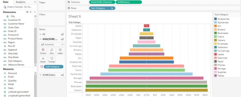
The Pyramid Charts help in visualising the hierarchies of the dimension variables.
Let’s explore how to create a Pyramid Chart in Tableau. Here, we have used EU Sample Superstore data to create our charts which is provided by Tableau by default.
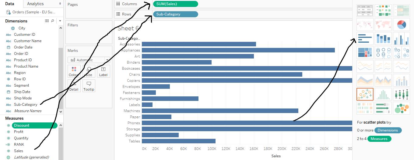
Let’s begin by creating a bar chart. Drag the variable Sub Category to Rows shelf from Dimensions section. Again, drag the Sales variable from Measures section to Columns. Then from Show Me section, click on horizontal bars. The bar graph would get created. The arrows in the diagram given below help in explaining the step. (We have already taught
how to make a bar graph on Tableau. So for more detailed explanation and the customisations, please refer to bar graph on Tableau).
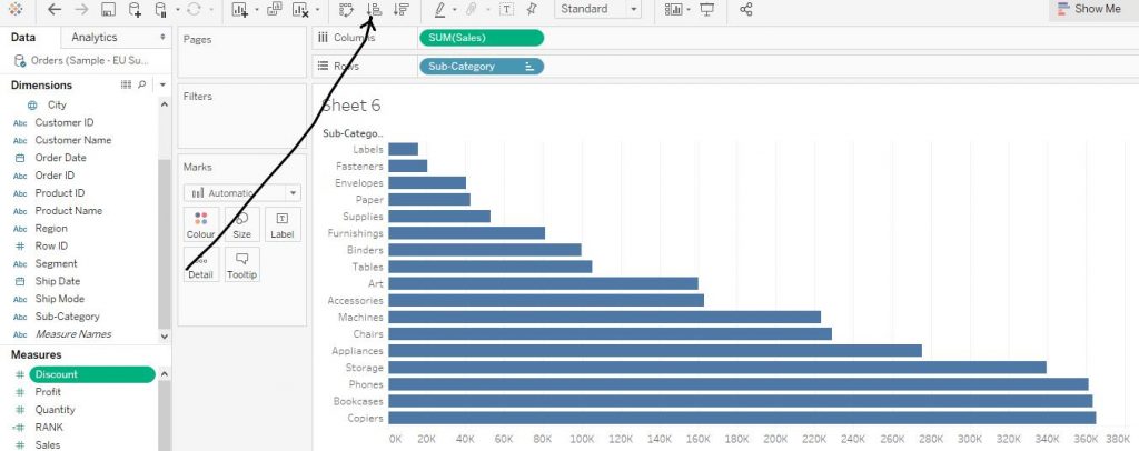
Now sort the graph in ascending order by clicking the icon on the as shown by the arrow in the diagram given below.
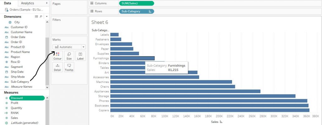
Now from the Dimensions section, drag the Sub Category variable to Colour in the Marks Card in order to differentiate easily the amount of sales across different items in the sub category variable with regard to colour and thus making it easily understandable. The arrow the diagram given below help in explaining this step.
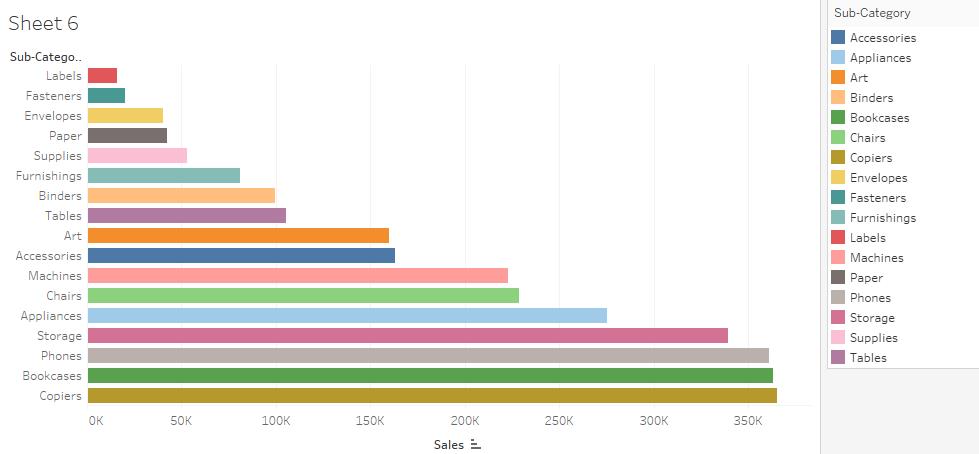
The bars now get colour as per the different items in the sub category variable as shown in the diagram given below. The colour codes of the items in Sub Category variable is shown in the right hand side of the graph.
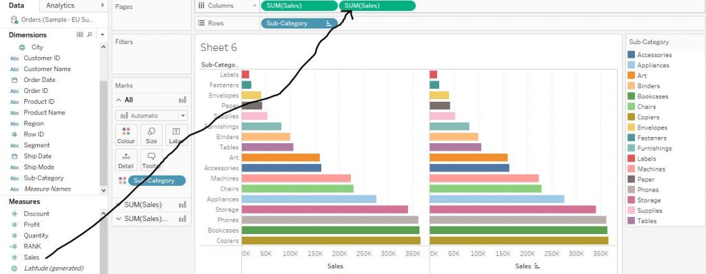
Again, drag the variable Sales from Measures section to Columns shelf as shown in the diagram given below by the arrow.
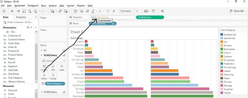
Now, double click on the Sales variable on Columns shelf and put a minus sign, i.e., ‘-‘ sign in front of the Sales and hit the enter button as shown by the arrow in the diagram given below.
Finally the Pyramid Chart is create as shown in the diagram given below.
We hope you understand Tableau Installation tutorial for beginners.Get success in your career as a Tableau developer by being a part of the
Prwatech, India’s leading
Tableau training institute in Bangalore.

 Now from the Dimensions section, drag the Sub Category variable to Colour in the Marks Card in order to differentiate easily the amount of sales across different items in the sub category variable with regard to colour and thus making it easily understandable. The arrow the diagram given below help in explaining this step.
 The bars now get colour as per the different items in the sub category variable as shown in the diagram given below. The colour codes of the items in Sub Category variable is shown in the right hand side of the graph.
 Again, drag the variable Sales from Measures section to Columns shelf as shown in the diagram given below by the arrow.
 Now, double click on the Sales variable on Columns shelf and put a minus sign, i.e., ‘-‘ sign in front of the Sales and hit the enter button as shown by the arrow in the diagram given below.
 Finally the Pyramid Chart is create as shown in the diagram given below.
 We hope you understand Tableau Installation tutorial for beginners.Get success in your career as a Tableau developer by being a part of the Prwatech, India’s leading Tableau training institute in Bangalore.


