Reference Lines Tutorial
The Below mentioned Tutorial will help to Understand the detailed information about tableau text table. So just follow all the tutorials of India’s leading
Best Tableau Training institute in Bangalore and Be a Pro
Tableau Developer.
Reference Lines are used as benchmarks to compare the values with constants or some calculated values. They can be in the form of lines and also in the form of band which represents some range.
Let’s explore the Reference Lines in Tableau in more detail. Here we have used Sample EU Superstore data which is provided by Tableau by default.
Let’s first make a bar graph by dragging Sub Category from Dimensions section to Columns shelf and Sales from Measures section to Rows shelf and then from Show Me section, click on bars to make the
Bar Chart. How to make bar graphs have already been taught in our previous chapters. For more details, refer to the chapter on bar charts.
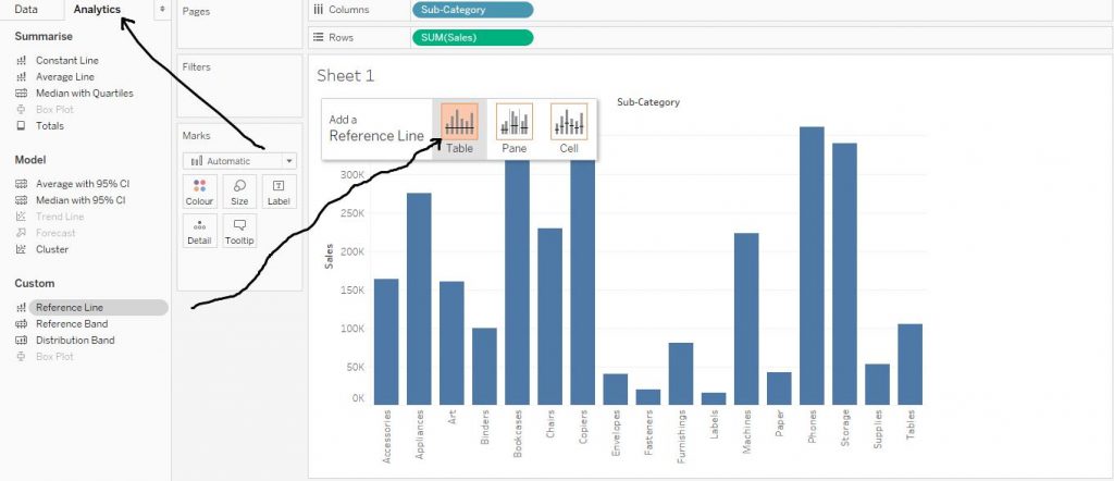
Now click on Analytics tab and drag Reference Line from Custom section to the Table and click on OK when the dialog box appears. The arrows in the diagram below describe the step.
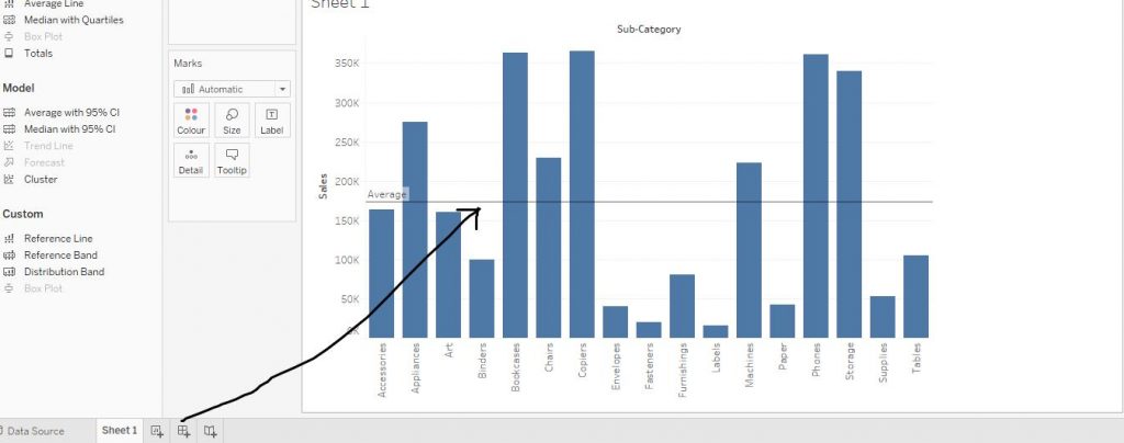
The reference line is created on the table as per the average. The diagram below shows the same.
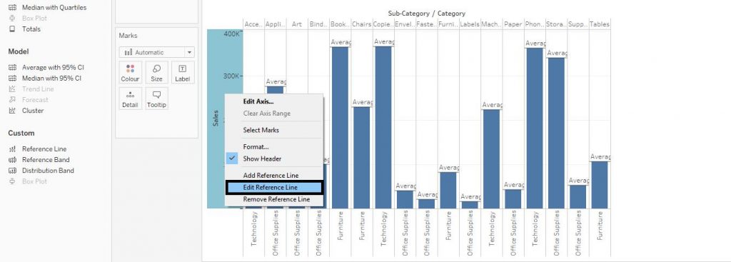
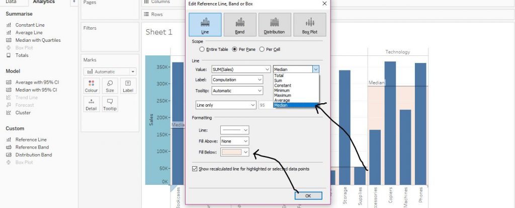
We would now learn reference lines in depth. Drag the Category variable from Dimensions section to Columns shelf. Then right click on the axis of the graph and click on Edit Reference Line from the drop down menu as shown in the diagram below.
Click on Per Pane in order to get the reference lines as per the sub groups (Per Cell would give the output per cell). Then select the aggregative measure, here we have chosen Median. Further, you can also do some formatting as we have selected Fill Below with pink colour. Click on OK. The arrows in the diagram below demonstrate the step.
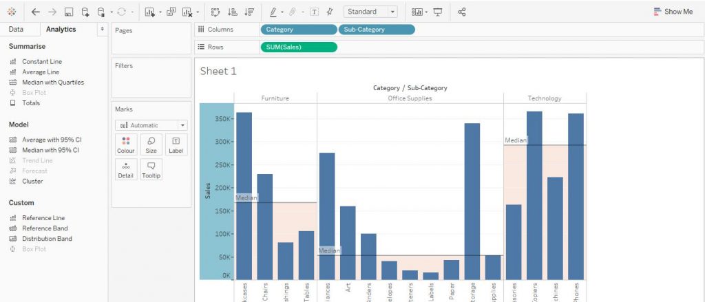
The final output is shown below in the diagram.
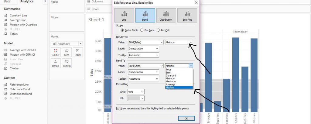
Click on Analytics tab and drag Reference Band from Custom section to table. From Band From section, click on Minimum and from Band To section, click on Median (Choose the options from the drop down menu as per the requirement). Now select a colour from Fill and click on OK. The arrows in the diagram below would help in understanding the step.
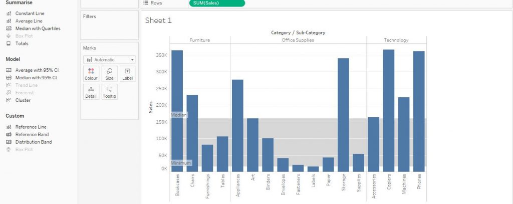
This forms a reference band as per the requirement. The band is shown in the diagram below.
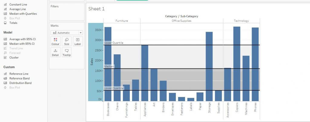
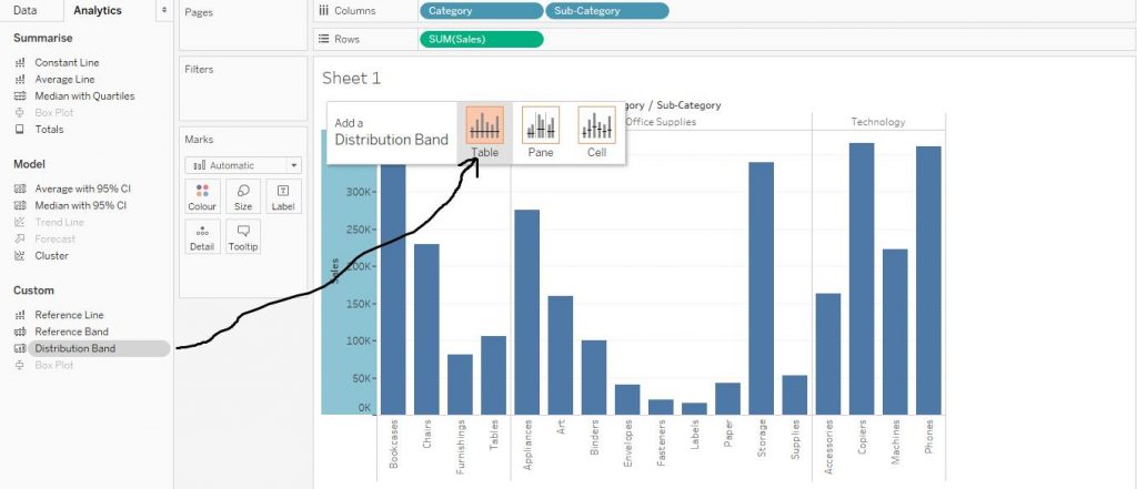
Let’s move onto Distribution Band now. From Analytics tab, drag Distribution Band from Custom section to Table as shown by the arrow in the diagram below.
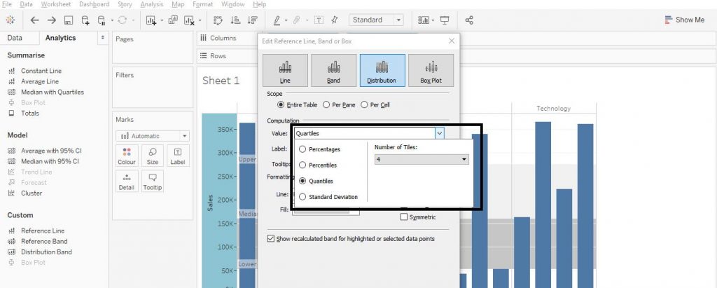
From the Value section in dialog box, click on Quantiles and select the Number of Tiles as 4 and select a solid line pattern from the Formatting section and click on OK. The diagram below explains the step.
The distribution band is thus formed. The diagram below shows the step.