How to create a Bump Chart in Tableau
Bump charts with Tableau, in this Tutorial one, you can learn how to Bump Charts in Tableau. Are you the one who is looking for the best platform which provides information about how to Bump Charts in Tableau? Or the one who is looking forward to taking the advanced Certification Course from India’s Leading
Tableau Training Institute? Then you’ve landed on the Right Path.
Bump charts are use to show the performance among different groups over a period of time with regard to their ranks. This chart is basically used to compare two dimension values.
Let’s explore Bump Chart in more detail. We have used Sample EU Superstore data which is provided by Tableau by default.
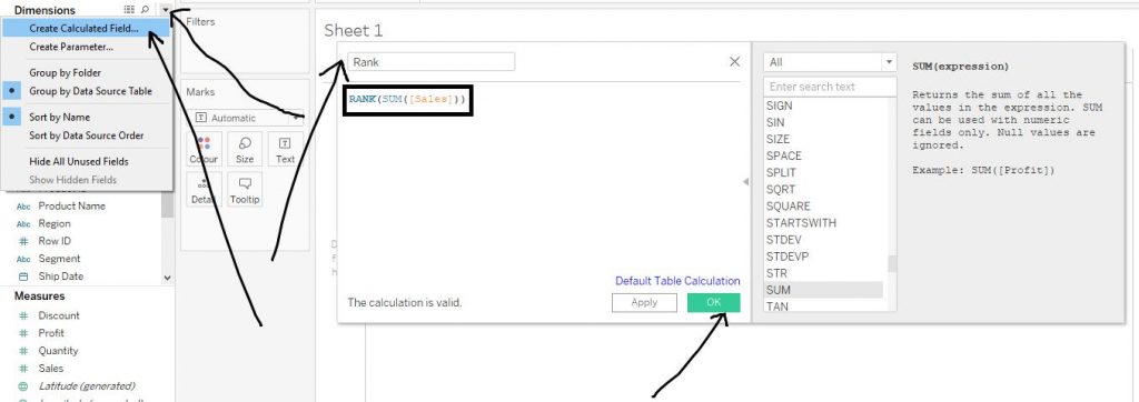
Firstly make a calculated field of rank on Sales. Click on the little arrow beside Dimensions and click on
Create Calculated Field from the drop down menu. Then write the code to find ranks as shown below in the diagram and click on apply and then OK.The arrows in the diagram help to understand the step.
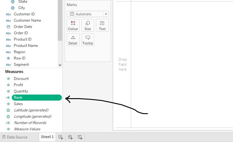
The Calculate Field, Rank gets create in the Measures section as shown in the diagram below.
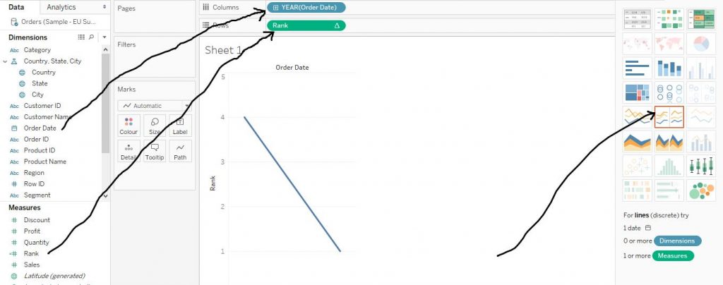
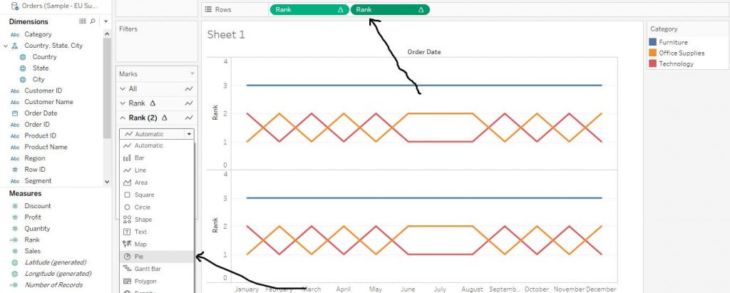
Now, drag the variable Order Date from Dimensions section to Columns shelf and calculated field Rank from Measures section to Rows shelf and click on Discrete
Lines Chart from Show Me section. The arrows in the diagram below help in understanding the step.
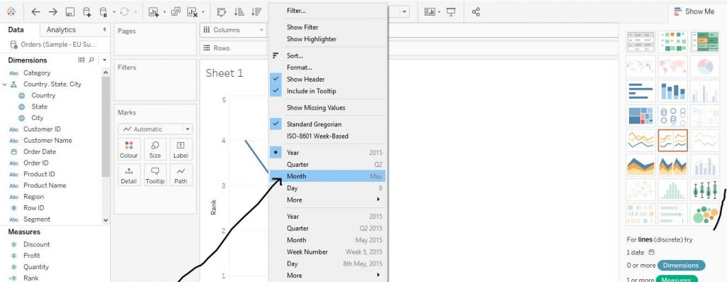
Now click on the little arrow in the Order Date from Columns shelf and change it to Month from Year as shown in the diagram below.
Again, drag the variable Category from Dimensions section to Colour in the Marks Card. Click on the little arrow on Rank from Rows shelf and click on Compute Using and then click on Category. This step is demonstrate by the arrows in the diagram given below.

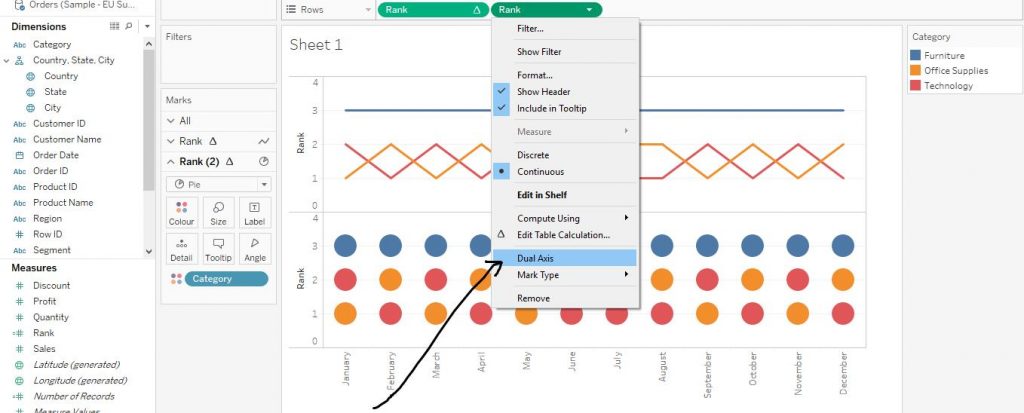
Drag the Calculated Field Rank to Rows shelf once again and change the shape to Pie from Marks Card. The arrows in the diagram below explain the step.
Right click on the second Rank variable in Rows shelf and click on Dual Axis as shown in the diagram given below.
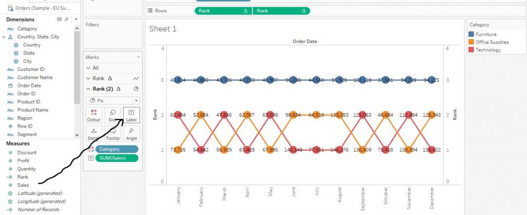
Drag Sales variable from Measures section to Label in Marks Card as shown in the diagram given below.
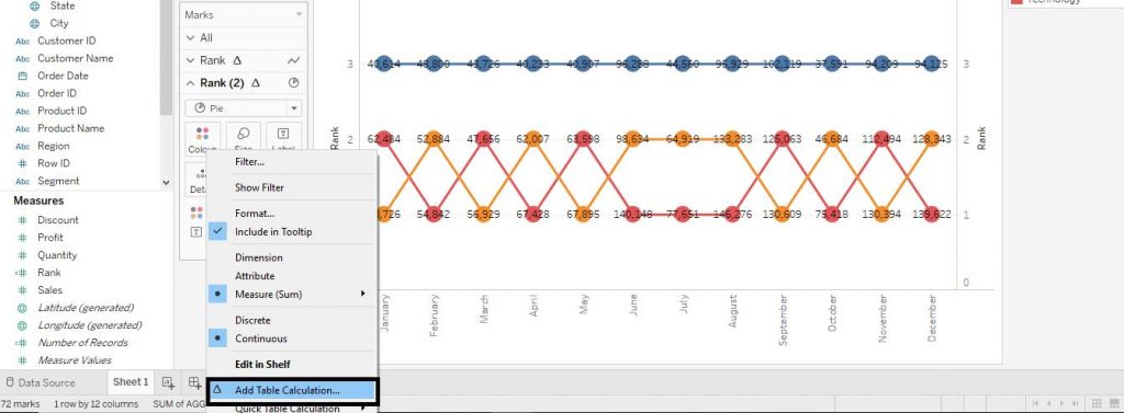
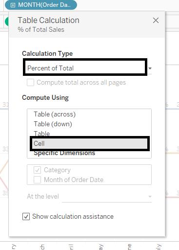
Right click on Sales from Label in Marks Card and then click on Add Table Calculation. The diagram given below helps in understanding the step.
Now, select ‘Percent of Total’ from Calculation Type section and ‘Cell’ from Compute Using section. The diagram below shows the step.
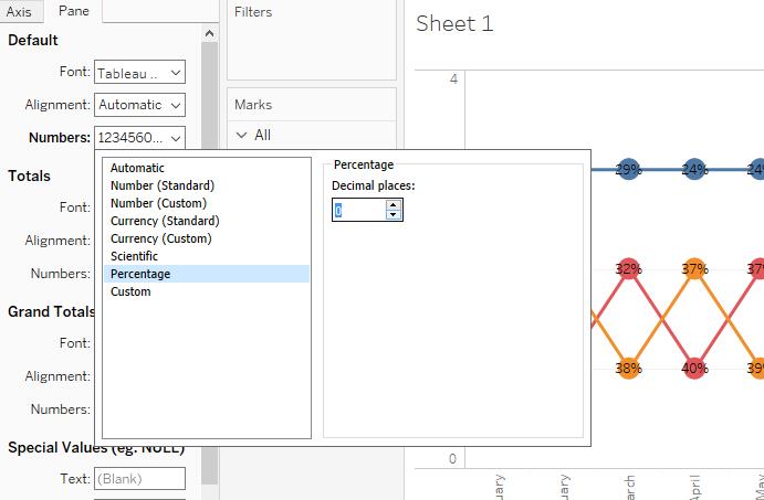
Right click on Sales from Label in Marks Card and click on Format. Then from Default section, click on Numbers. Select Percentage from the drop down menu and then reduce the decimal places to ‘0’ as shown by the arrow in the diagram given below.
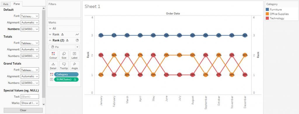
Our final Bump Chart is now ready as shown below in the diagram below.
I hope you understand get started with tableau blog. If you wish to master in Tableau, Get trained for
tableau training institute in Bangalore by
Prwatech, India’s largest E-learning Platform.

