Column Chart
Column Chart Guide & Documentation
A column chart is a type of chart that visualizes data using rectangular bars with lengths proportional to the values they represent. Each bar typically corresponds to a category or group, and the height or length of the bar represents the magnitude of the data point.
Column Chart Guide
These tools provide intuitive interfaces and functionalities for creating and customizing column charts to suit specific data visualization needs. When creating column charts, it’s essential to consider factors such as data accuracy, chart readability, color choices, axis labels, and chart titles to effectively communicate insights and findings to the audience.Overall, column charts are versatile and widely used visualizations that help users analyze and communicate data effectively, making them a valuable tool in data analysis and decision-making processes.
Creating Column Chart
Creating Column Chart in Power BI Desktop using the loaded dataset. Click on the “Column Chart” icon. This will add an empty column chart visual to the report canvas.
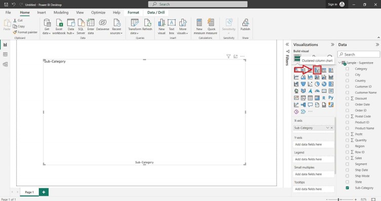
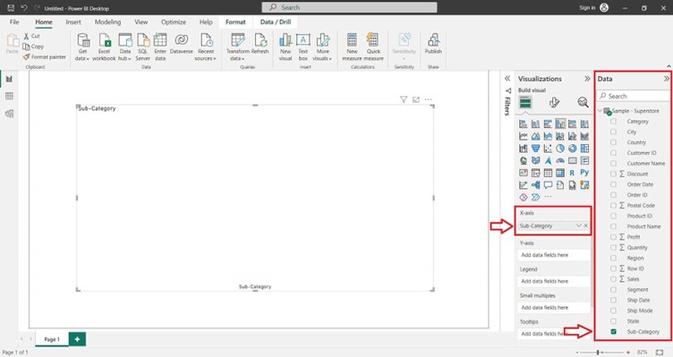
In the “Build a visual” pane on the right side, locate the dataset fields you want to use for the column chart. Select the desired field in the “X-axis” section of the “Visualizations” pane.
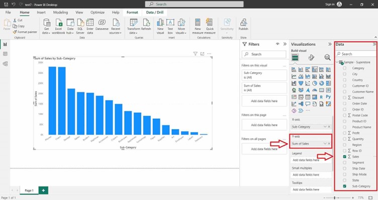
Select the desired field in the “Y-axis” section of the “Visualizations” pane.
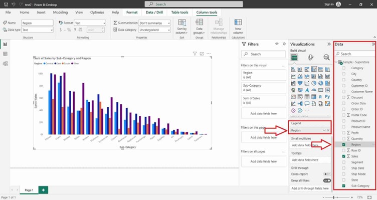
You can also select the desired field in the “Legend” section of the “Visualizations” pane.
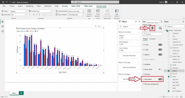
For Formatting the Column Chart and adding Data Labels click on the Format icon. In the right hand site a Format tab will appear and search Data Label and click on “ON” button.
Column Chart Guide & Documentation