Stacked Column Chart
Stacked Column Chart
A stacked column chart is a type of bar chart that represents data as a series of vertically stacked rectangular bars. Each bar in the chart represents a category, and the height of the bar corresponds to the total value of the category. The bars are divided into segments, with each segment representing a different sub-category or component of the total value.
When creating stacked column charts, it’s essential to consider factors such as data accuracy, chart readability, color choices, labels, and chart titles to effectively communicate insights to the audience. Additionally, it’s crucial to ensure that the stacking order of the bars accurately represents the relationships between the categories and sub-categories being visualized.
Column Chart
Creating Column Chart in Power BI Desktop using the loaded dataset. Click on the “Stacked Column Chart” icon. This will add an empty visual to the report canvas. 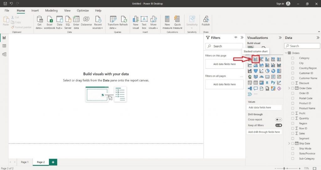
In the “Visualizations” pane on the right side, locate the dataset fields you want to use for the column chart. Select the desired field into the “X-axis” section of the “Visualizations” pane. 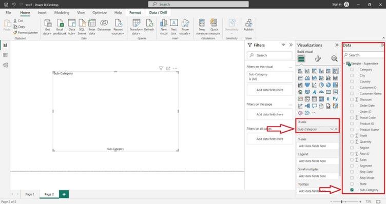
Select the desired field into the “Y-axis” section of the “Visualizations” pane. 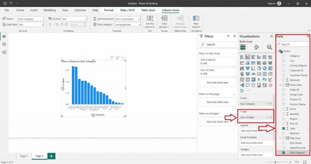
You can also select the desired field into the “Legend” section of the “Visualizations” pane. 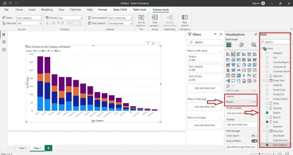
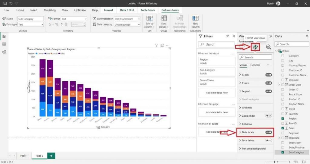
For Formatting the Column Chart and adding Data Labels click on the Format icon. In the right hand site a Format tab will appear and search Data Label and click on “ON” button.