Pie Chart
A Complete Guide to Pie Charts
A pie chart is a circular statistical graphic that is divided into slices to illustrate numerical proportions. Each slice represents a proportionate part of the whole, and the size of each slice is proportional to the quantity it represents. Pie charts are widely used for visualizing categorical data and comparing the relative sizes of different categories within a dataset.
Users can utilize various software tools such as Microsoft Excel, Google Sheets, or data visualization libraries in programming languages like Python (matplotlib, seaborn), R (ggplot2), or JavaScript (D3.js, Chart.js) to create pie charts.
When creating pie charts, it’s essential to consider factors such as data accuracy, chart readability, color choices, labels, and chart titles to effectively communicate insights to the audience. Additionally, it’s crucial to avoid using pie charts for complex datasets with many categories or when precise comparisons between categories are necessary, as pie charts can sometimes be less effective in conveying this information compared to other chart types like bar charts or line charts.
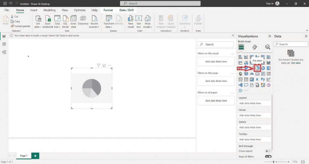
Creating a Pie Chart in Power BI Desktop using the loaded dataset.
Click on the ” Pie Chart” icon. This will add an empty Pie Chart visual to the report canvas.
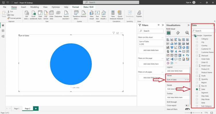
In the ” Visualizations ” pane on the right side, locate the dataset fields you want to use for the column chart. Select the desired field in the “Values” section of the “Visualizations” pane.
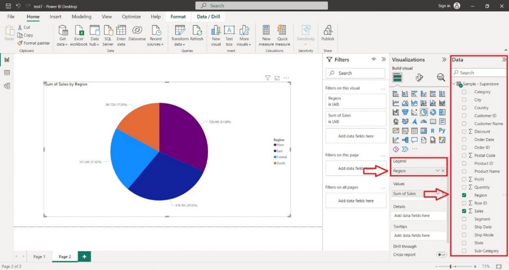
You can also select the desired field in the “Legend” section of the “Visualizations” pane.
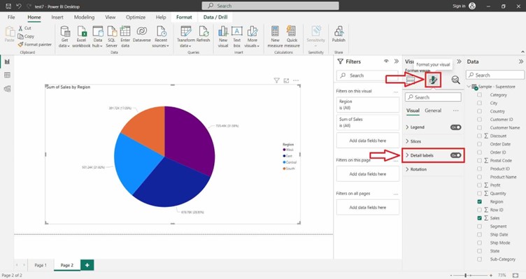
For Formatting the Pie Chart and adding Data Labels click on the Format icon. On the right-hand side, a Format tab will appear search Data Label and click on the “ON” button.