Ribbon Chart
Use ribbon charts in Power BI
Ribbon charts are a unique and visually compelling visualization type available in Power BI, Microsoft’s business intelligence and analytics platform. Also known as Marimekko charts or Mekko charts, ribbon charts provide a powerful way to visualize and analyze categorical data across multiple dimensions.
Ribbon charts consist of horizontal bars, each representing a category, with the width of the bars proportional to the value they represent. Additionally, ribbon charts allow for sub-category analysis by dividing each bar into segments, with the width of each segment representing the proportion of the total value contributed by the sub-category.
One of the key advantages of ribbon charts is their ability to display both the relative and absolute values of data in a single visual. This makes ribbon charts particularly useful for comparing the distribution of values across categories and sub-categories, identifying patterns, and gaining insights into the underlying data structure.
Creating Ribbon Chart in Power BI Desktop using the loaded dataset. Click on the “Ribbon Chart” icon. This will add an empty Ribbon Chart visual to the report canvas.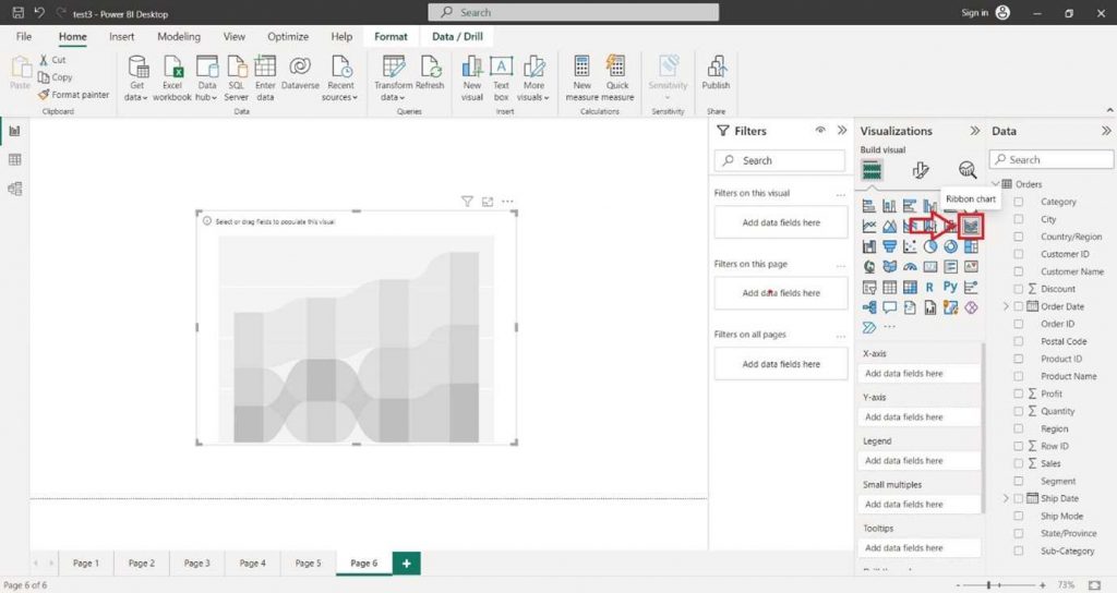
In the “Visualizations” pane on the right side, locate the dataset fields you want to use for the column chart. Select the desired field into the “X-axis” section of the “Visualizations” pane.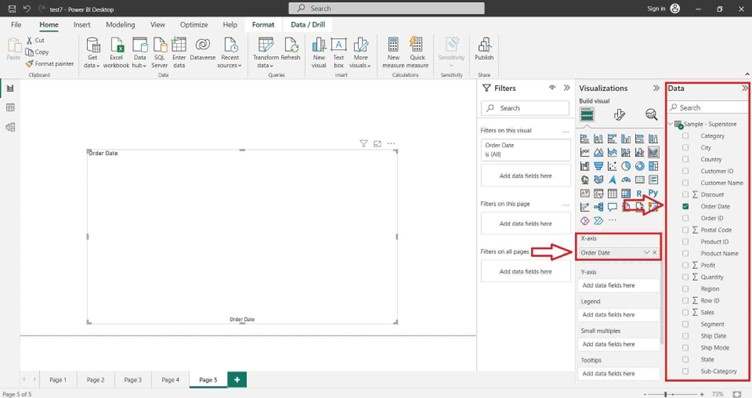
Select the desired field into the “Y-axis” section of the “Visualizations” pane.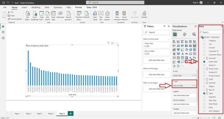
You can also select the desired field into the “Legend” section of the “Visualizations” pane.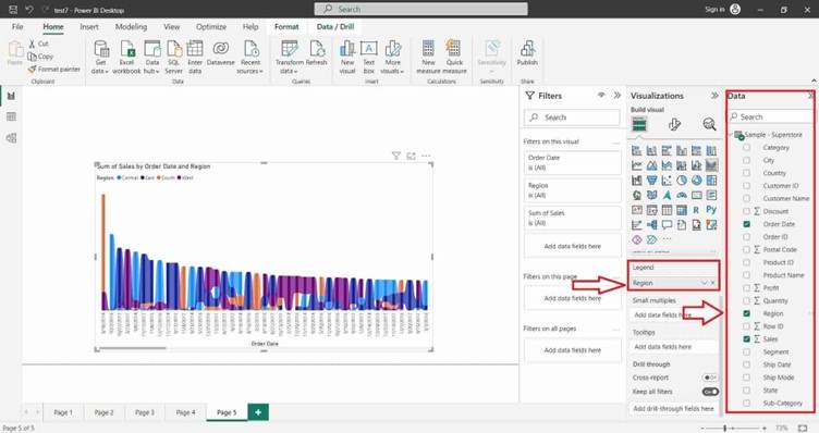
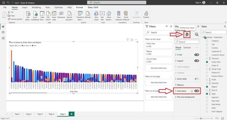
For Formatting the Ribbon Chart and adding Data Labels click on Format icon. In the right-hand site, a Format tab will appear and search Data Label and click on “ON” button.