Donut Chart
Donut Chart
Creating Donut Chart in Power BI Desktop using the loaded dataset. Click on the “Donut Chart” icon. This will add an empty Donut Chart visual to the report canvas.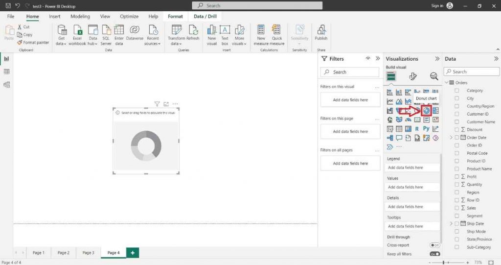
In the “Visualizations” pane on the right side, locate the dataset fields you want to use for the column chart. Select the desired field into the “Values” section of the “Visualizations” pane.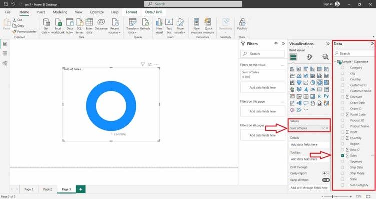
You can also select the desired field into the “Legend” section of the “Visualizations” pane.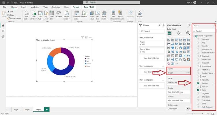
For Formatting the Donut Chart and adding Data Labels click on Format icon. In the ight-hand site, a Format tab will appear and search Data Label and click on “ON” button.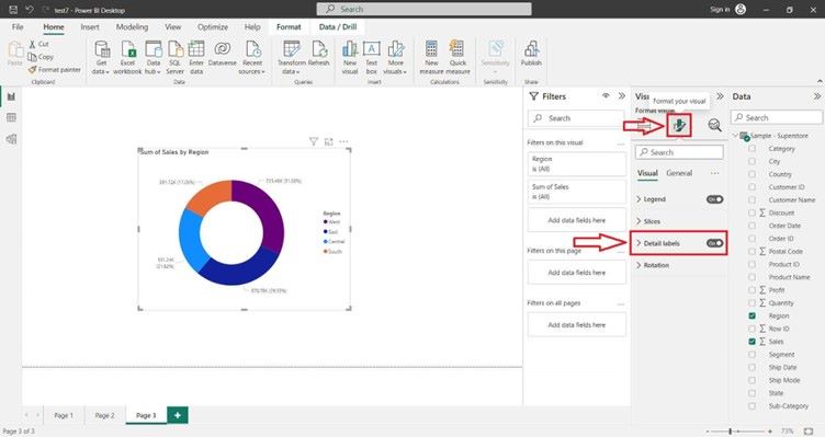
0
0