Funnel Chart
A Complete Guide to Funnel Charts
A funnel chart is a type of data visualization that represents stages in a process as progressively decreasing proportions. It resembles a funnel shape, with the widest part at the top representing the initial stage and the narrowest part at the bottom representing the final stage. Funnel charts are commonly used to visualize the flow or conversion rates of a process, such as sales pipelines, marketing funnels, or website visitor journeys.
Users can utilize various software tools such as Microsoft Excel, Google Sheets, or data visualization libraries in programming languages like Python (matplotlib, seaborn), R (ggplot2), or JavaScript (D3.js, Chart.js) to create funnel charts.
When creating funnel charts, it’s essential to consider factors such as data accuracy, chart readability, color choices, labels, and chart titles to effectively communicate insights to the audience.
Funnel Chart
Creating Funnel Chart in Power BI Desktop using the loaded dataset. Click on the “Funnel Chart” icon. This will add an empty Funnel Chart visual to the report canvas.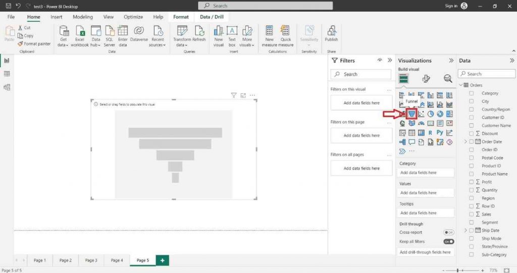
In the “Visualizations” pane on the right side, locate the dataset fields you want to use for the column chart. Select the desired field into the “Category” section of the “Visualizations” pane.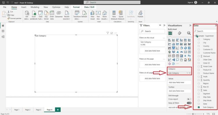
You can also select the desired field into the “Values” section of the “Visualizations” pane.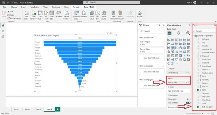
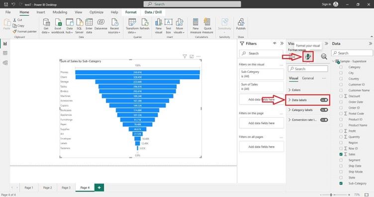
For Formatting the Funnel Chart and adding Data Labels click on Format icon. In the right hand site a Format tab will appear and search Data Label and click on “ON” button.