K Means Clustering in Machine Learning
K Means Clustering in Machine Learning
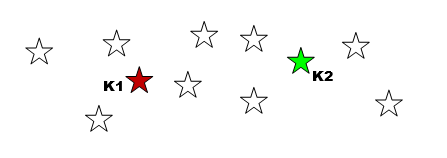
Imagine a shop owner with ten thousand customers and no labels. Nobody has told her which customers are bargain hunters, which are loyal regulars and which only buy at festivals. Yet those groups almost certainly exist, hidden in the data. Finding them without being told what to look for is called clustering, and K means is the best known way to do it.
K means is an unsupervised learning method. You give it a table of numbers and a target number of groups, which is the K. It sorts every row into one of those groups so that rows in the same group are as similar as possible. It is used for customer segmentation, grouping documents, compressing images, spotting unusual behaviour and exploring data before building other models.
This guide explains how K means works with a small example you can follow with a pencil. Then we build a complete Python program with scikit learn, and answer the question that trips up most beginners: how do you choose K. We also cover scaling, initialisation, the limits of the method, how it compares with other clustering methods, common mistakes and a short FAQ.
What is Clustering?
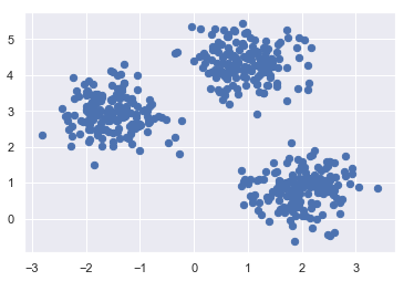
Clustering means grouping data points so that points in a group are more alike than points in different groups. There are no right answers supplied in advance, which is why it is called unsupervised. The algorithm has to find the structure by itself, and you judge the result by whether the groups make sense.
How the K Means Algorithm Works?
K means is built around the centroid, the average position of all the points in a group. The algorithm alternates between two simple moves: assign points to the nearest centroid, then move each centroid to the middle of its points. Here are the steps.
1. Choose K. Decide how many clusters you want.
2. Pick K starting centroids. Choose K points to start from. Many implementations use random data points.
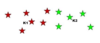
3. Assign each point to its nearest centroid.Distance is usually the straight line Euclidean distance. Each point joins the cluster of the closest centroid.
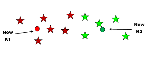
4. Recompute each centroid. Move every centroid to the average position of the points now assigned to it.
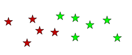
5. Repeat steps 3 and 4.Keep reassigning points and moving centroids until the centroids stop moving, or move very little.
A Tiny Example You Can Check by Hand
Take six numbers on a line: 1, 2, 4, 9, 11 and 12. We want two clusters, and we start with centroids at 2 and 9.
- The points 1, 2 and 4 are closest to the centroid at 2. The points 9, 11 and 12 are closest to the centroid at 9.
- The first centroid moves to the average of 1, 2 and 4, which is 2.33. The second moves to the average of 9, 11 and 12, which is 10.67.
- Every point is still closest to the same centroid as before, so nothing changes. The algorithm has converged.
Real data has more dimensions and many more points, but the logic is exactly the same.
What is Inertia?
To judge a clustering, K means uses inertia, which is the sum of the squared distances from each point to the centroid of its cluster. It is also called the within cluster sum of squares. Small inertia means tight clusters. The algorithm is really trying to make inertia as small as it can.
inertia = sum of ( distance from each point to its own centroid ) squared
Inertia has a catch. It always falls when you add more clusters, and reaches zero if every point gets its own cluster. So you cannot simply choose the K with the lowest inertia. That leads to the next question.
How to Choose K?
The Elbow Method
Run K means for several values of K and record the inertia each time. Plot inertia against K. At first it drops sharply, because the clusters are becoming meaningful. Then it flattens, because you are only splitting groups that were already tight. The bend in the curve, shaped like an elbow, marks a sensible K.
The Silhouette Score
The silhouette score measures, for each point, how close it is to its own cluster compared with the nearest other cluster. It runs from minus one to plus one. Values near one mean points sit well inside their clusters. Values near zero mean clusters overlap. Choose the K with the highest average score.
The best advice is to use both, and then ask whether the groups make business sense. A mathematically neat K that produces groups nobody can describe is not much use.
K Means in Python Step by Step
This program builds a dataset with three natural groups, tries several values of K, prints inertia and the silhouette score for each, then fits the final model and draws it. It uses k means plus plus initialisation, which spreads the starting centroids apart, and runs the algorithm 10 times with different starts to avoid a poor result.
import numpy as np
import matplotlib.pyplot as plt
from sklearn.datasets import make_blobs
from sklearn.cluster import KMeans
from sklearn.metrics import silhouette_score
X, _ = make_blobs(n_samples=300, centers=3, cluster_std=0.8, random_state=42)
print(“k inertia silhouette”)
for k in range(2, 8):
model = KMeans(n_clusters=k, init=”k-means++”, n_init=10, random_state=42).fit(X)
score = silhouette_score(X, model.labels_)
print(k, round(model.inertia_, 1), round(score, 3))
kmeans = KMeans(n_clusters=3, init=”k-means++”, n_init=10, random_state=42)
labels = kmeans.fit_predict(X)
centers = kmeans.cluster_centers_
print(“Cluster sizes:”, np.bincount(labels))
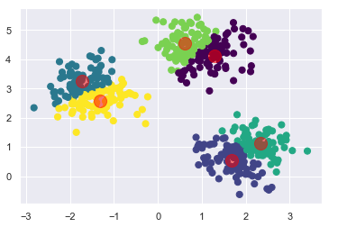
plt.scatter(X[:, 0], X[:, 1], c=labels, s=20, cmap=”viridis”)
plt.scatter(centers[:, 0], centers[:, 1], c=”red”, s=150, marker=”X”)
plt.title(“K means with k = 3”)
plt.savefig(“kmeans_plot.png”, dpi=120)
When I ran it, the output was:
k inertia silhouette
2 5526.5 0.721
3 362.8 0.878
4 318.1 0.697
5 273.4 0.503
6 233.6 0.327
7 201.0 0.351
Cluster sizes: [100 100 100]
Reading the Results
- The elbow is at 3.Inertia collapses from 5,526 at K of 2 down to 363 at K of 3, and then falls only slowly.
- The silhouette agrees.It peaks at 0.878 for K of 3 and drops after that.
- The clusters are the right size.Each group has exactly 100 points, which matches how the data was built.
The plot colours each point by its cluster and marks the centroids with red crosses.
Things That Affect K Means Results
- K means uses distance, so a feature measured in thousands will drown out one measured in decimals. Standardise your features first, for example with StandardScaler.
- Random starting points can lead to a poor result. K means plus plus and several runs make this much safer.
- The shape of the clusters.K means assumes clusters that are roughly round and similar in size. It struggles with long, curved or very uneven groups.
- Many dimensions.With very many features, distances become less useful. Running PCA first can help and also speeds up the work.
- A few extreme points can drag a centroid away from its group.
Advantages and Limitations of K Means
Advantages
- Simple to understand and to explain.
- Fast, and it scales well to large datasets.
- One main setting, K.
- A faster variant, MiniBatchKMeans, handles very large data with a small loss in quality.
Limitations
- You must choose K yourself.
- Sensitive to scale, outliers and starting points.
- Finds round clusters only.
- Works with numbers, so categories need to be encoded first, and other methods may suit them better.
K Means Compared With Other Clustering Methods
| Point | K means | Hierarchical | DBSCAN |
|---|---|---|---|
| Need to choose K | Yes | Not up front | No |
| Cluster shape | Round | Flexible | Any shape |
| Handles outliers | Poorly | Moderately | Yes, labels them as noise |
| Speed on big data | Fast | Slow | Moderate |
| Best for | Large data, compact groups | Small data, a family tree of groups | Irregular shapes and noisy data |
Applications of K Means
- Customer segmentation.Grouping buyers by behaviour and spend.
- Document and topic grouping.Clustering articles or support tickets.
- Image compression.Reducing an image to a handful of representative colours.
- Anomaly detection.Points far from every centroid deserve a look.
- Recommendation systems.Grouping similar users or items.
- Data exploration.A quick first look at structure before modelling.
Common Mistakes to Avoid
- Not scaling the features. The biggest numbers win.
- Picking K by lowest inertia. It always falls as K grows.
- Trusting one run. Use k means plus plus and several starts.
- Using it on non round clusters. Try DBSCAN or hierarchical clustering instead.
- Forgetting to describe the clusters. A cluster only helps if you can say what it is.
- Using an old import. The samples_generator module is gone. Import from sklearn.datasets.
K means is simple enough to understand in minutes and strong enough to use for years. Scale your data, choose K with the elbow and silhouette together, run it with several starts, and always look at what each cluster actually contains.